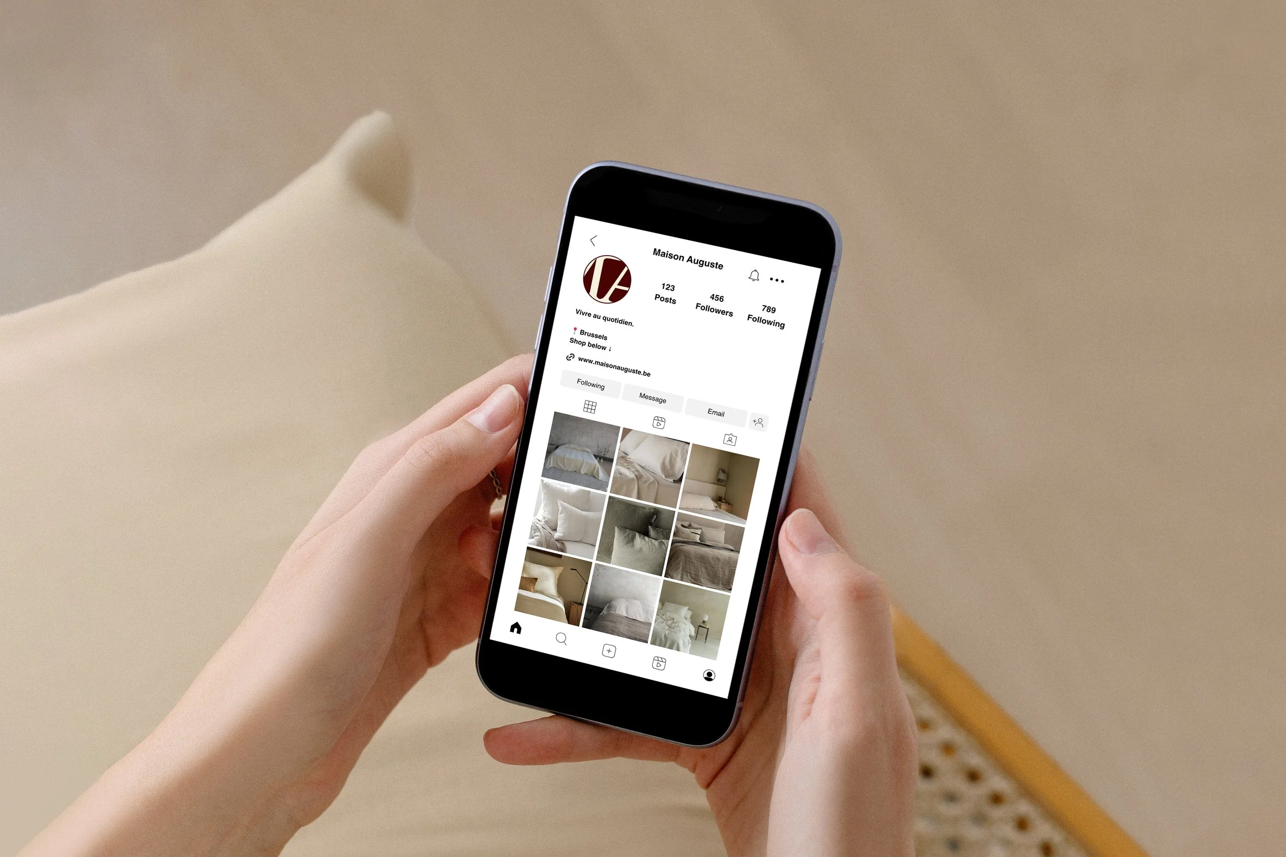
Maison Auguste
Branding / Visual Identity / Packaging / Art DirectionMaison Auguste is a Belgian linen brand built on a single conviction: a home is not decorated, it is inhabited.
The home linen market speaks almost entirely in one voice. Soft, neutral, aspirational. Every brand promises the same morning, the same light, the same bed. Maison Auguste needed to say something different without saying more. The challenge was restraint in positioning: to build an identity that felt genuinely intimate rather than styled, closer to the person who actually sleeps in the bed than to the photographer who shoots it.
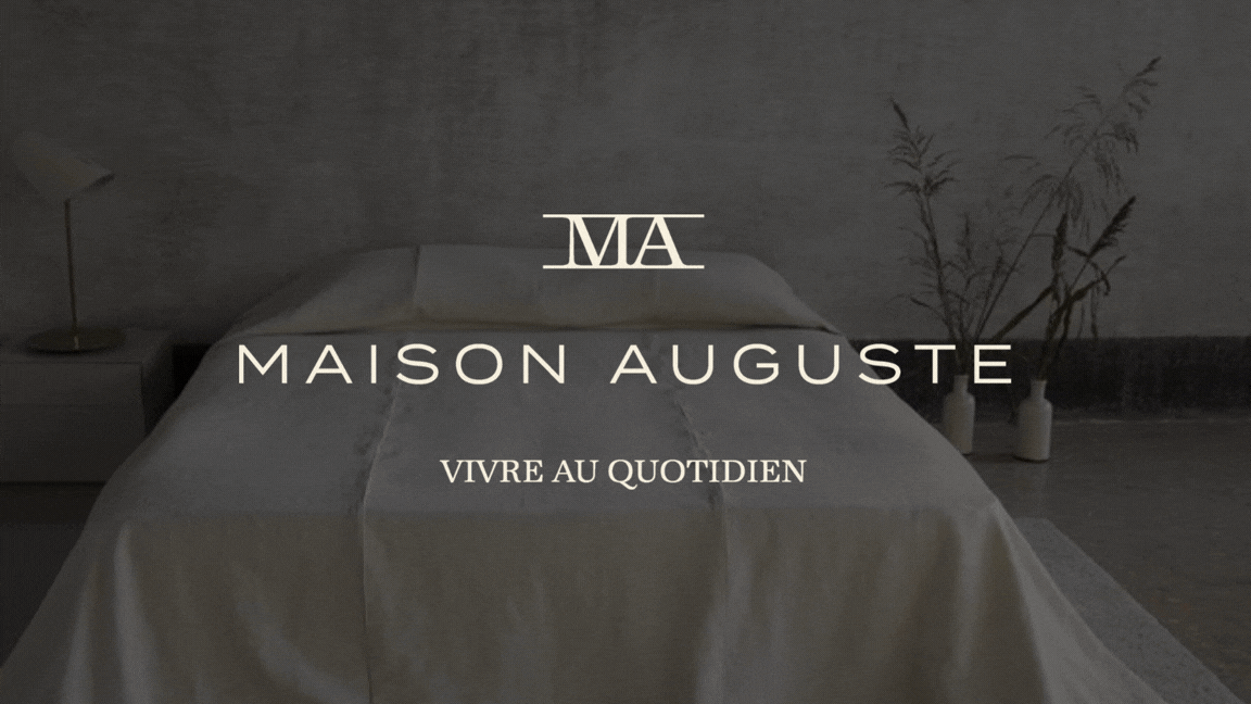
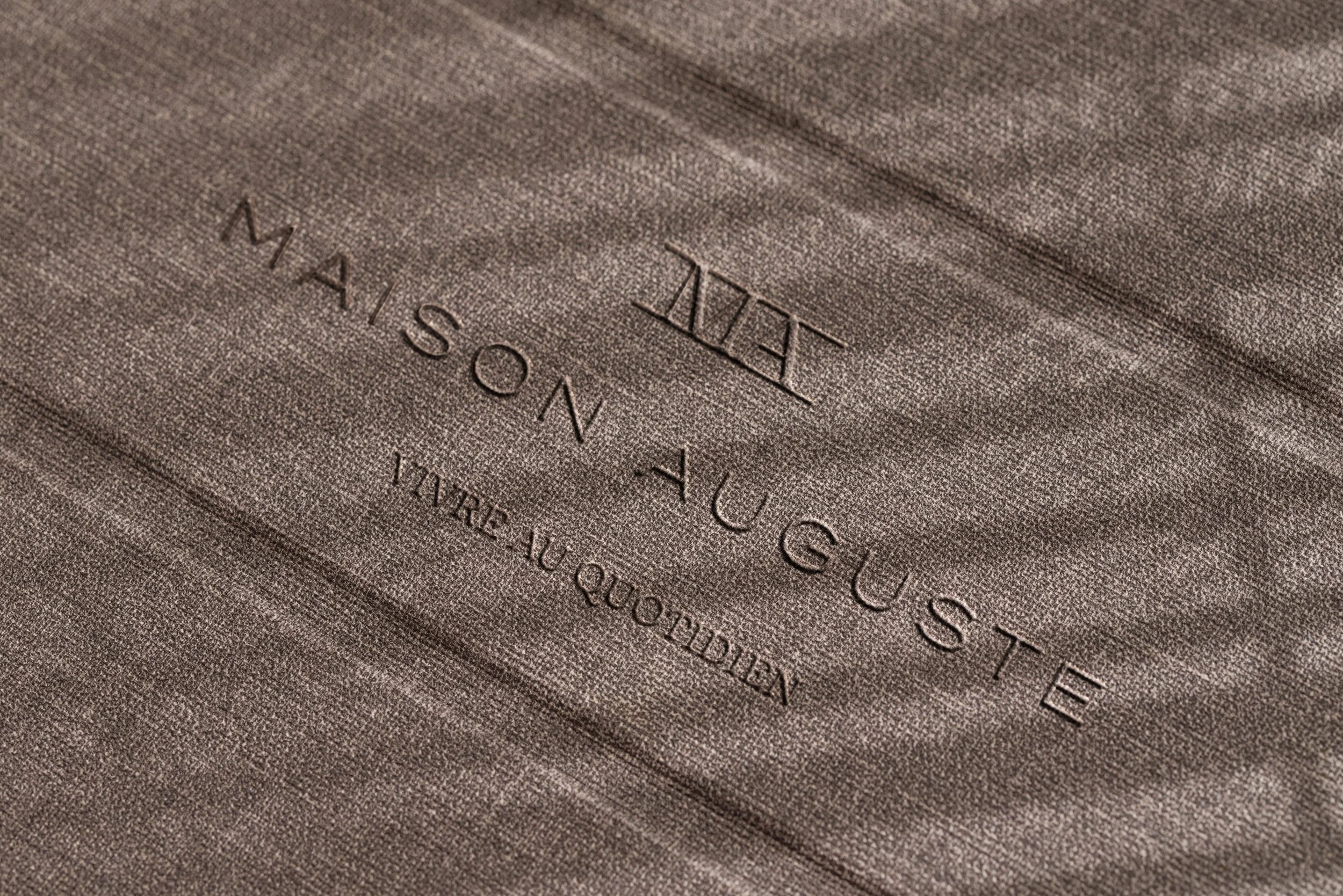
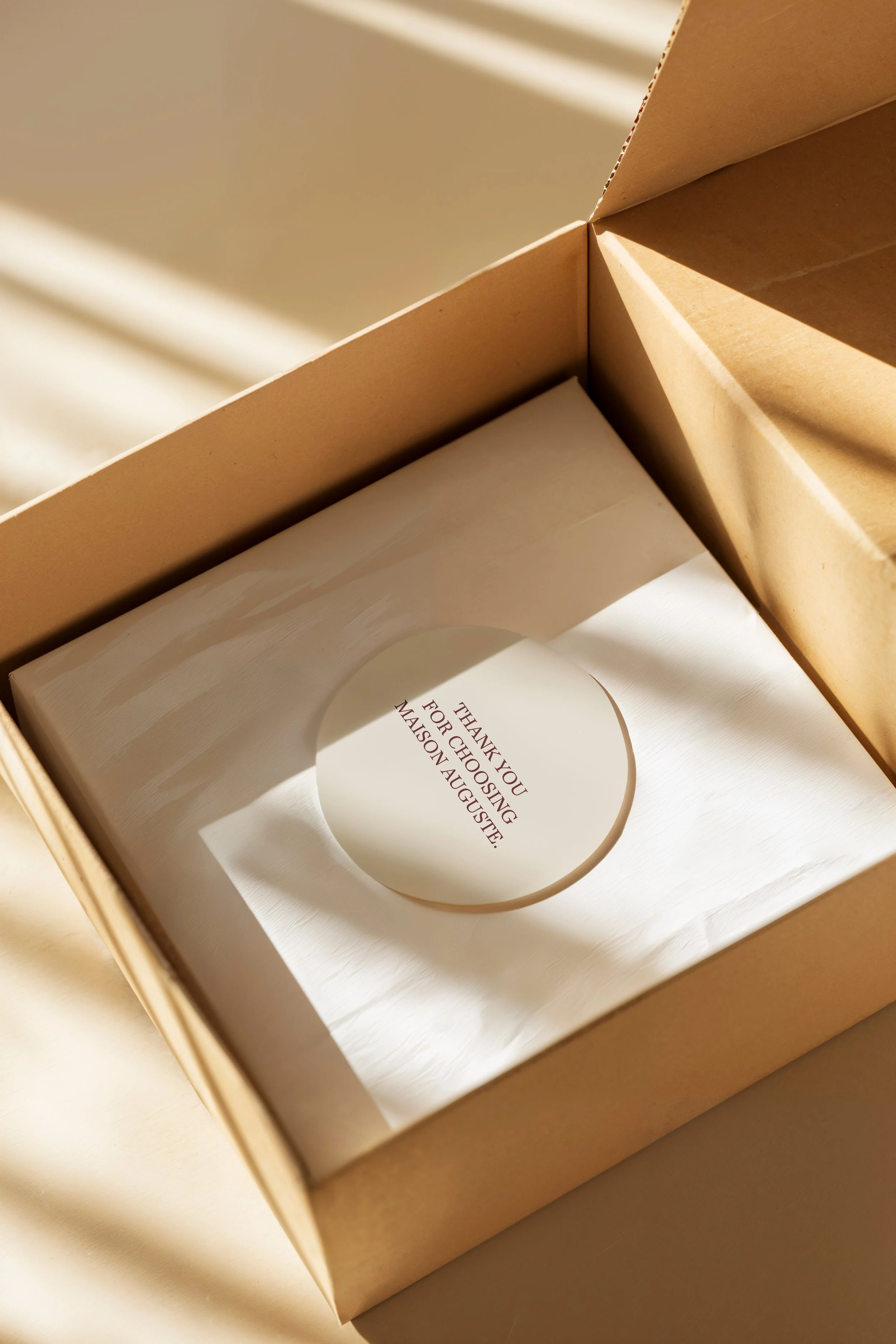
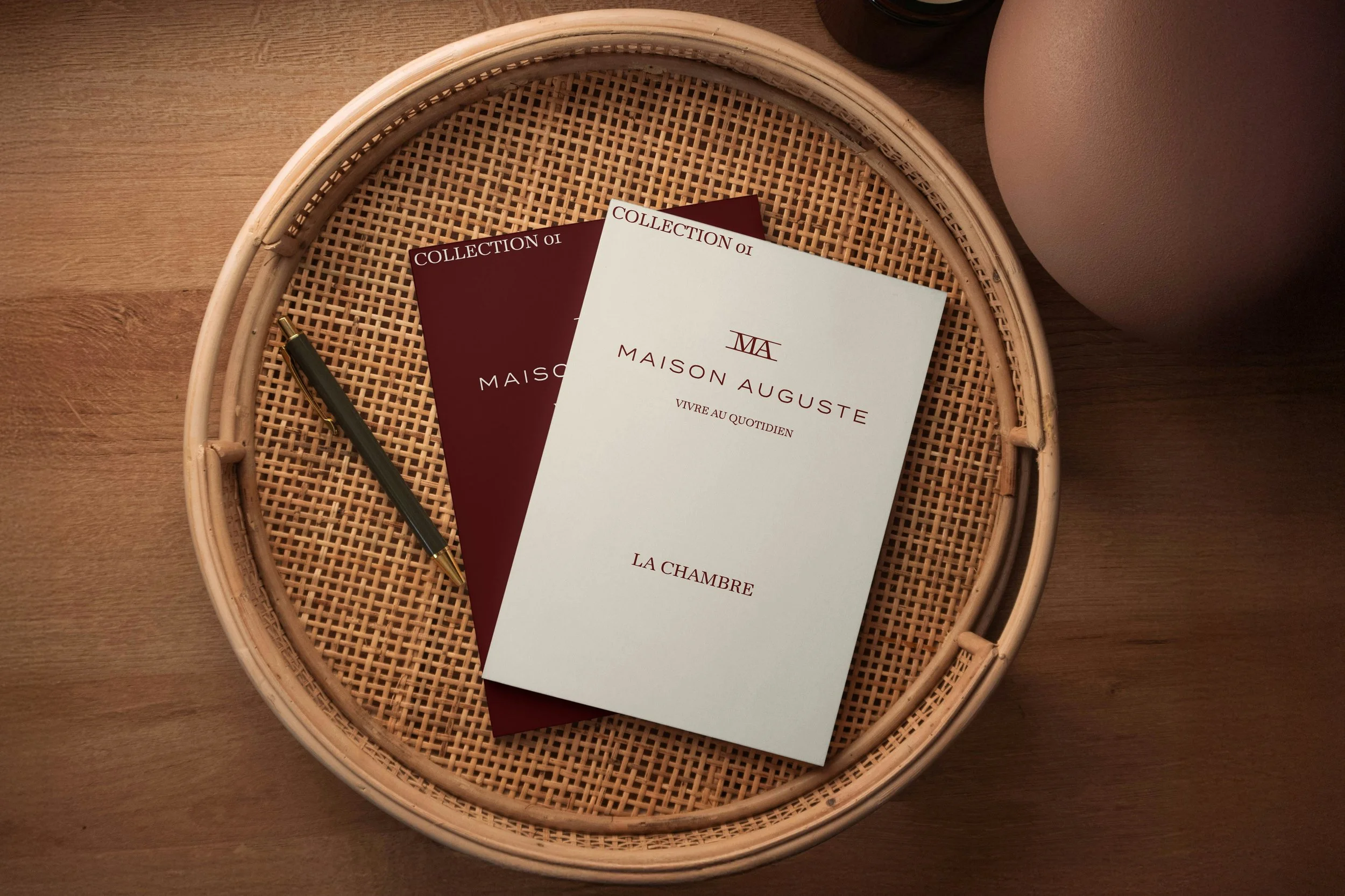
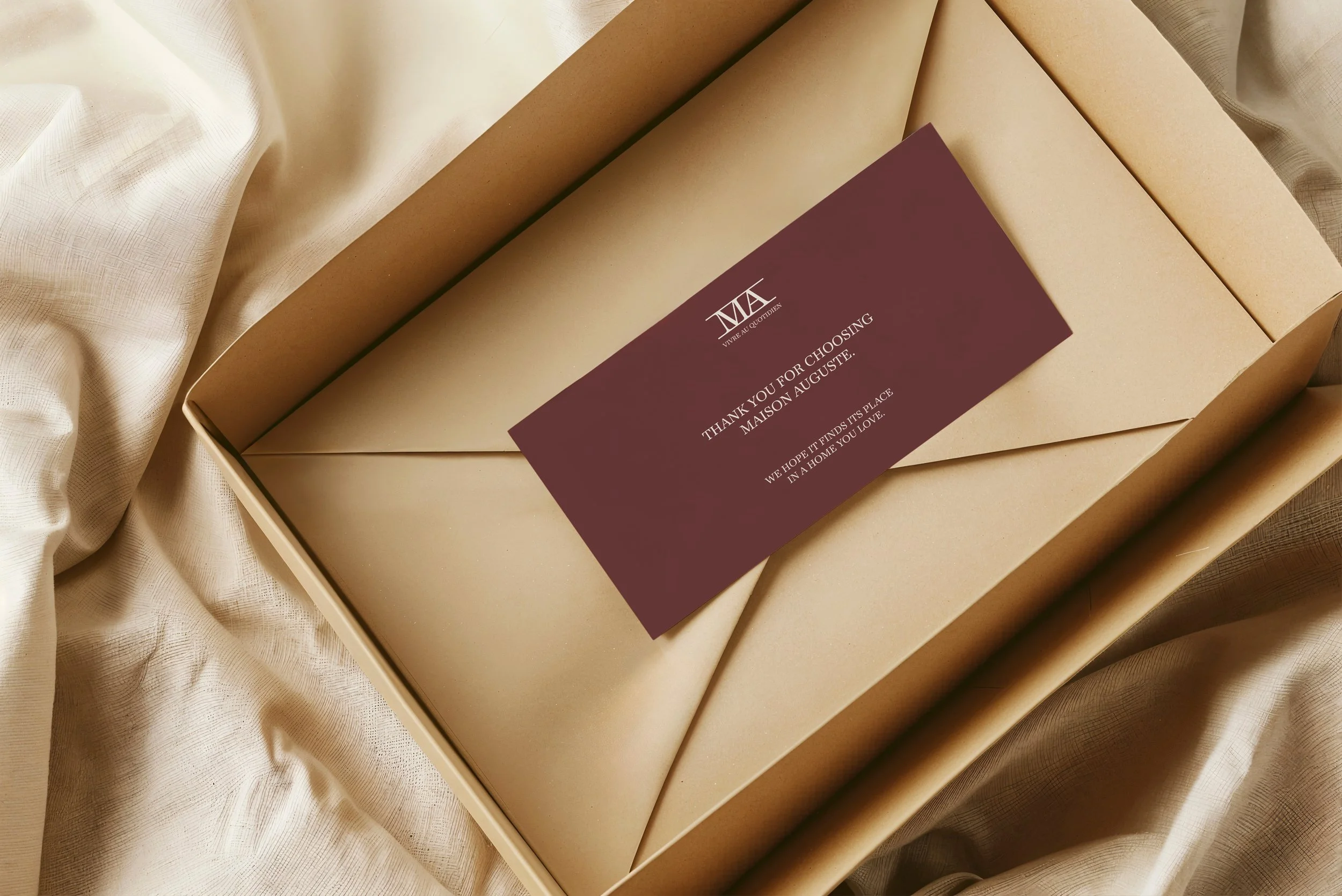
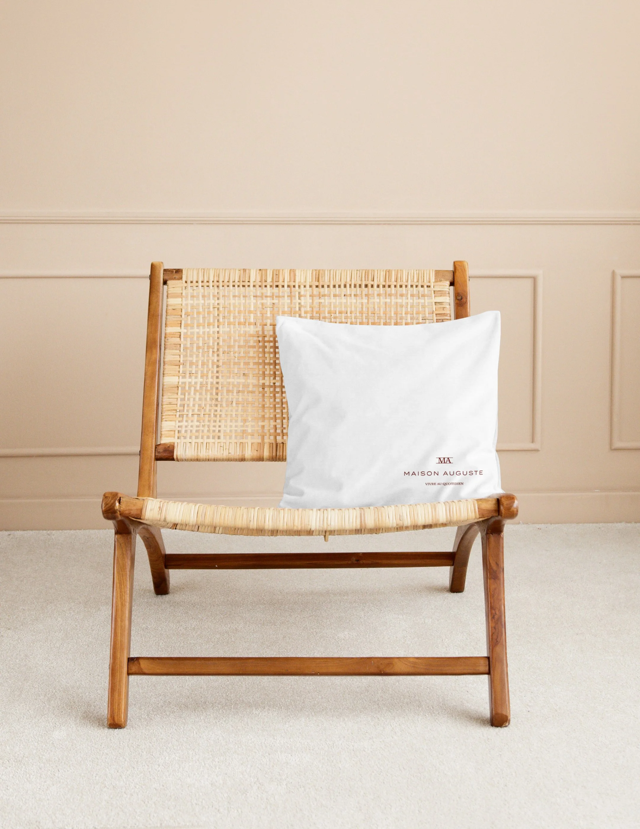
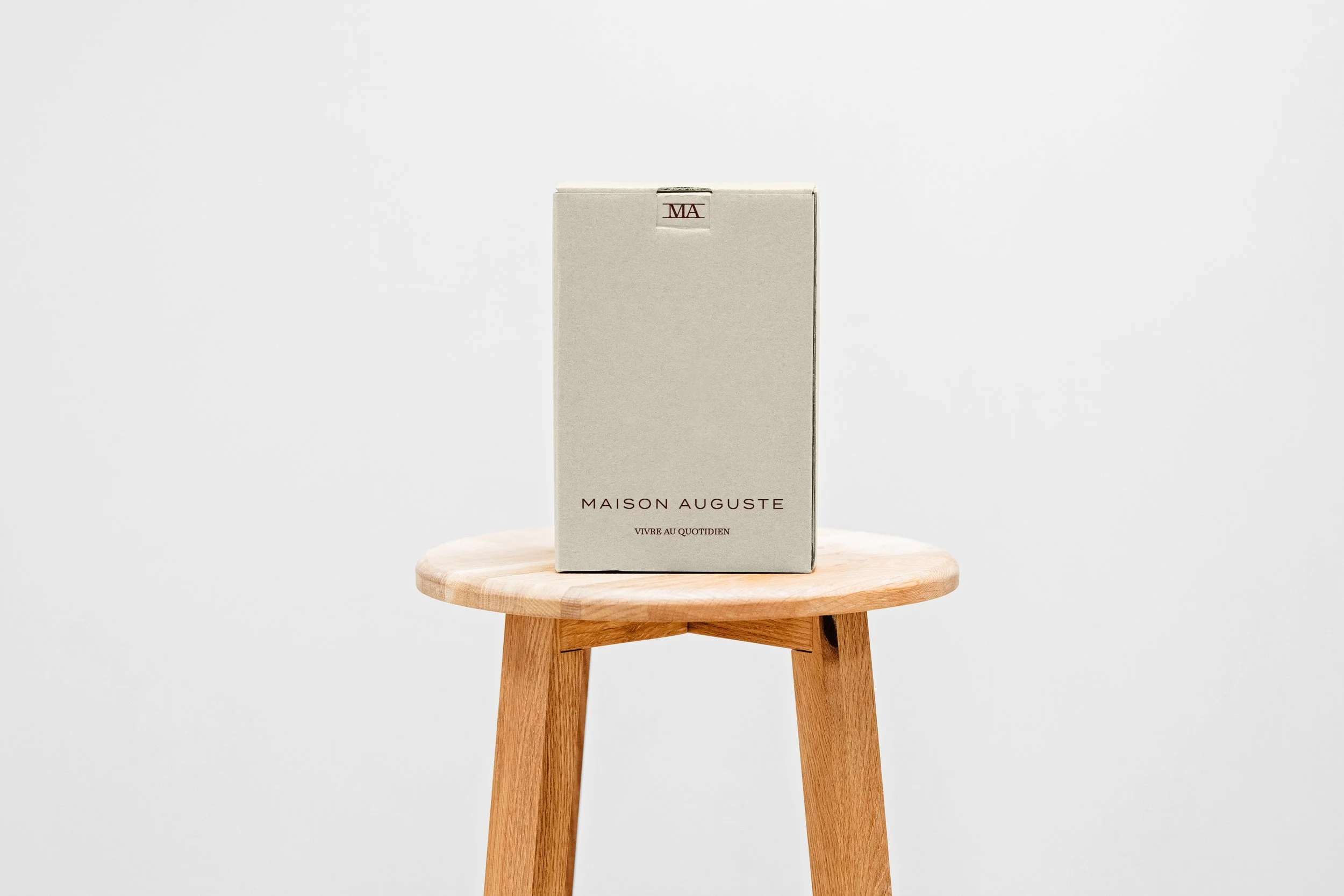
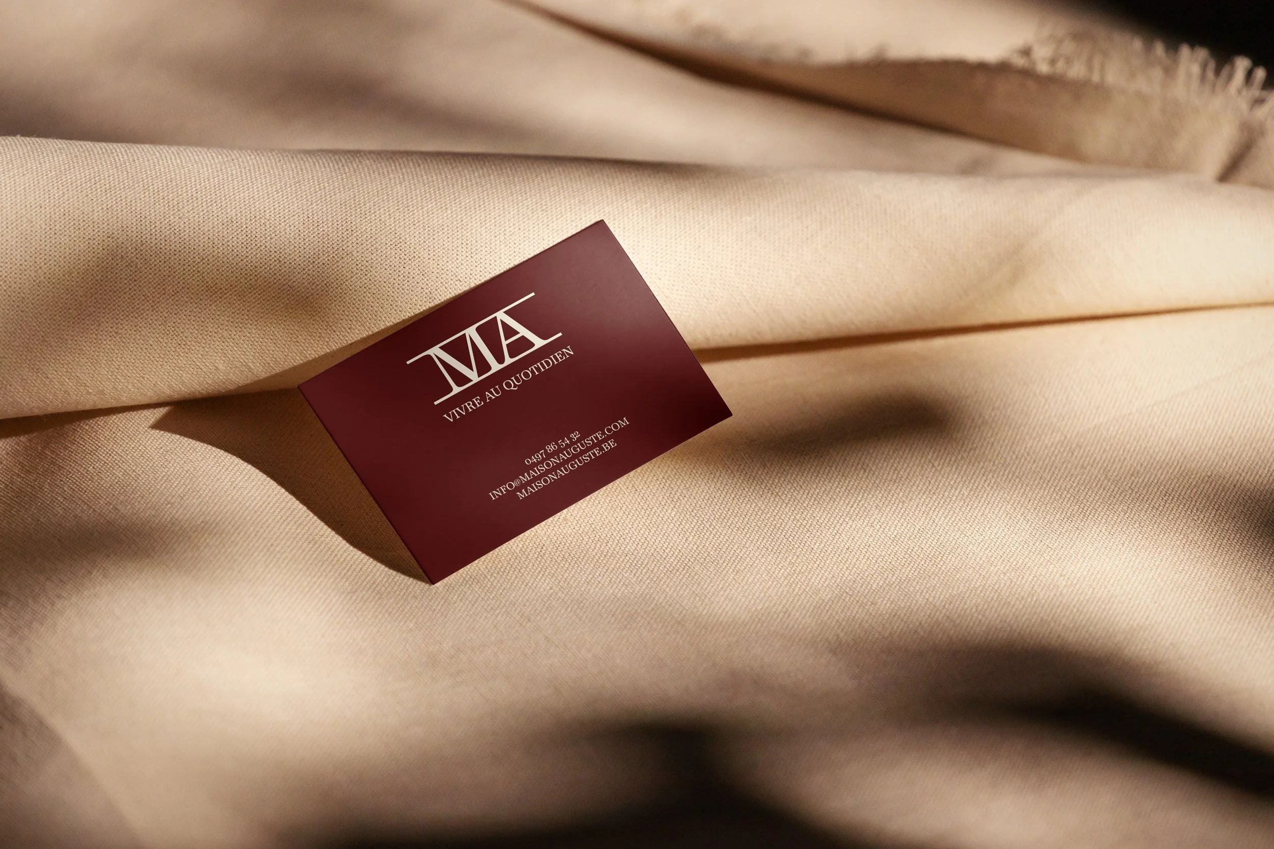
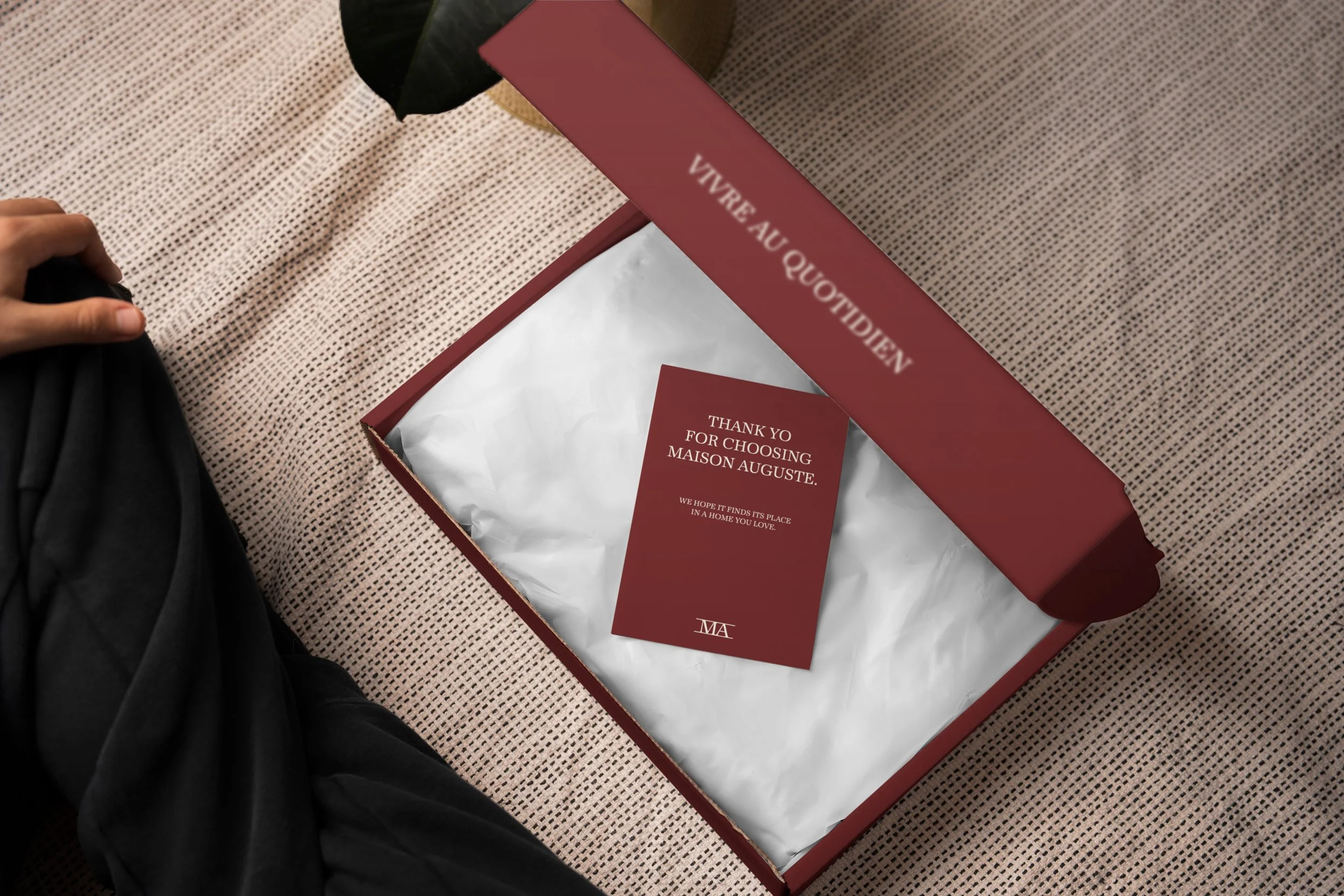
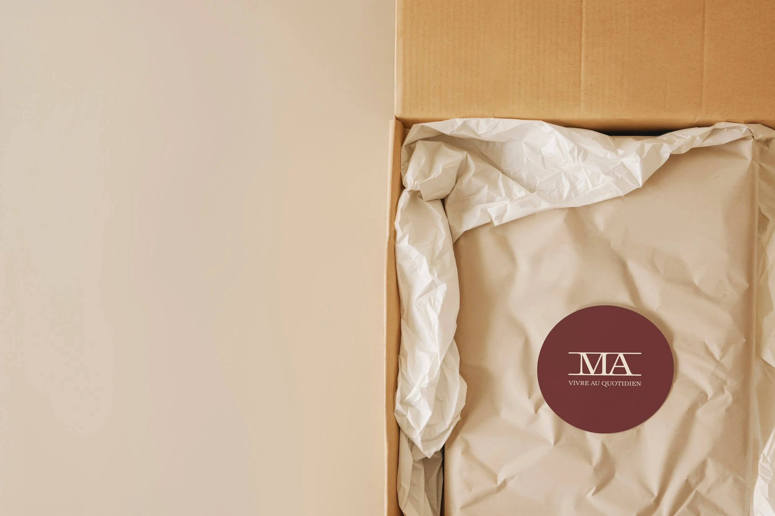
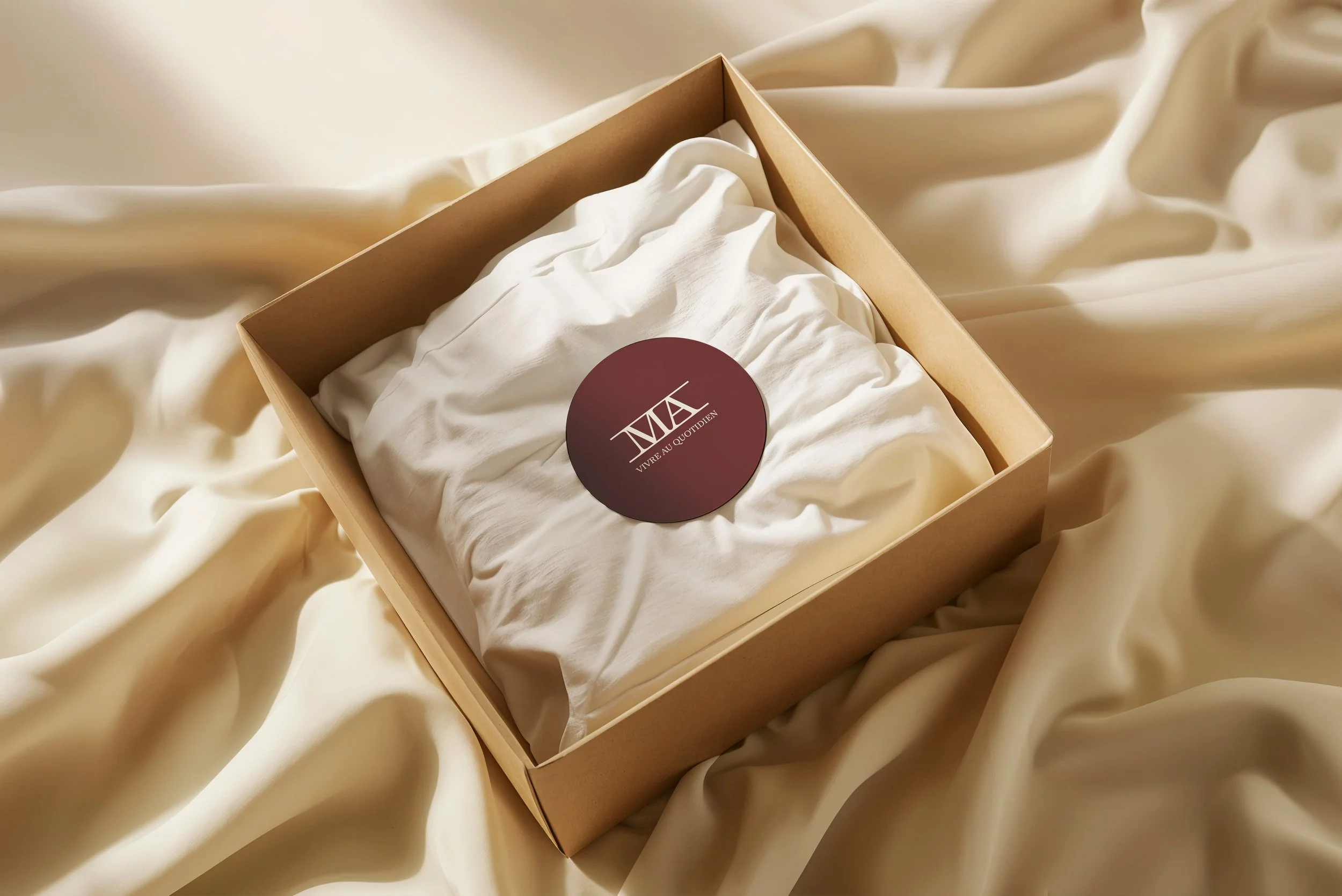
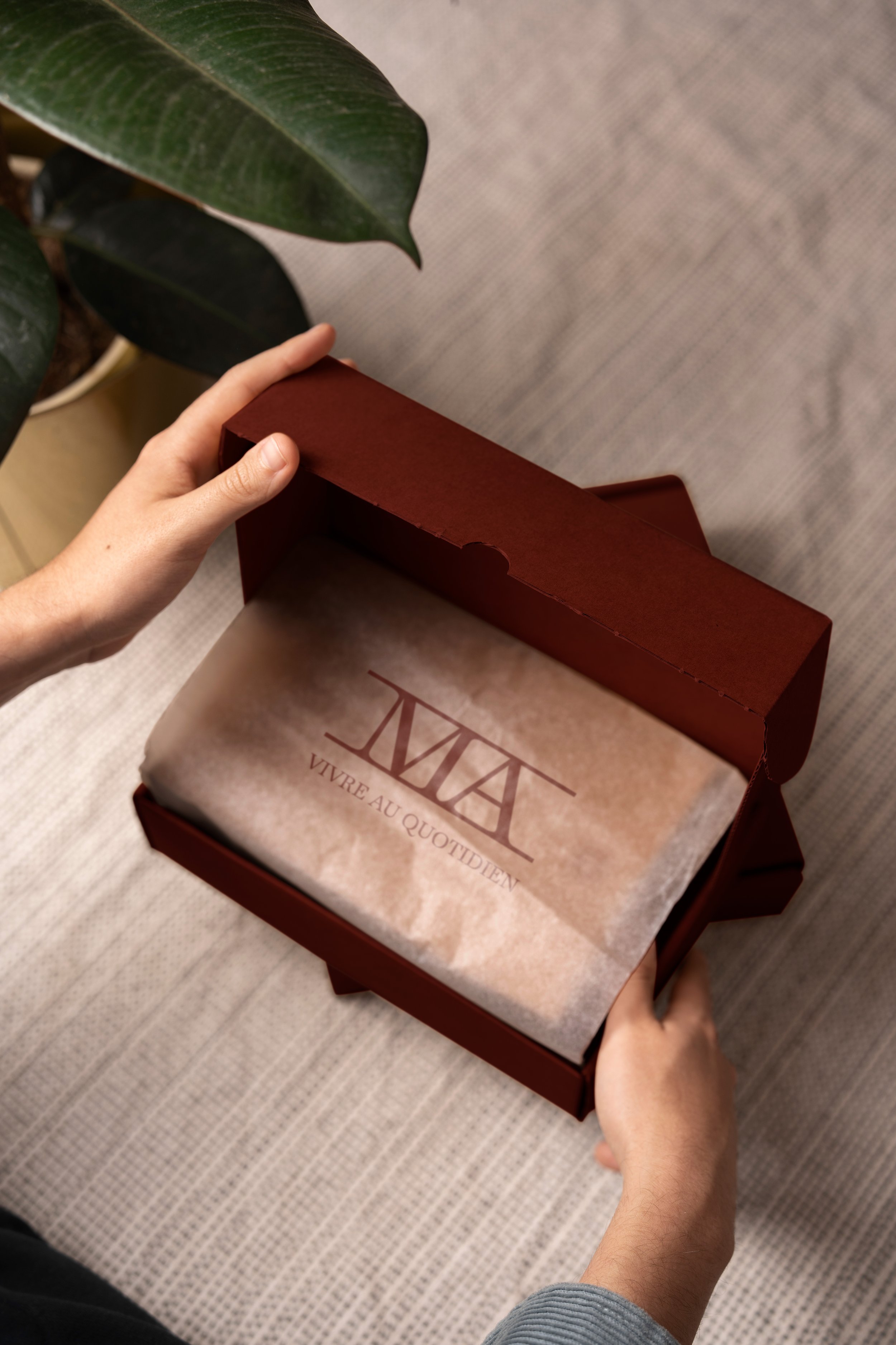
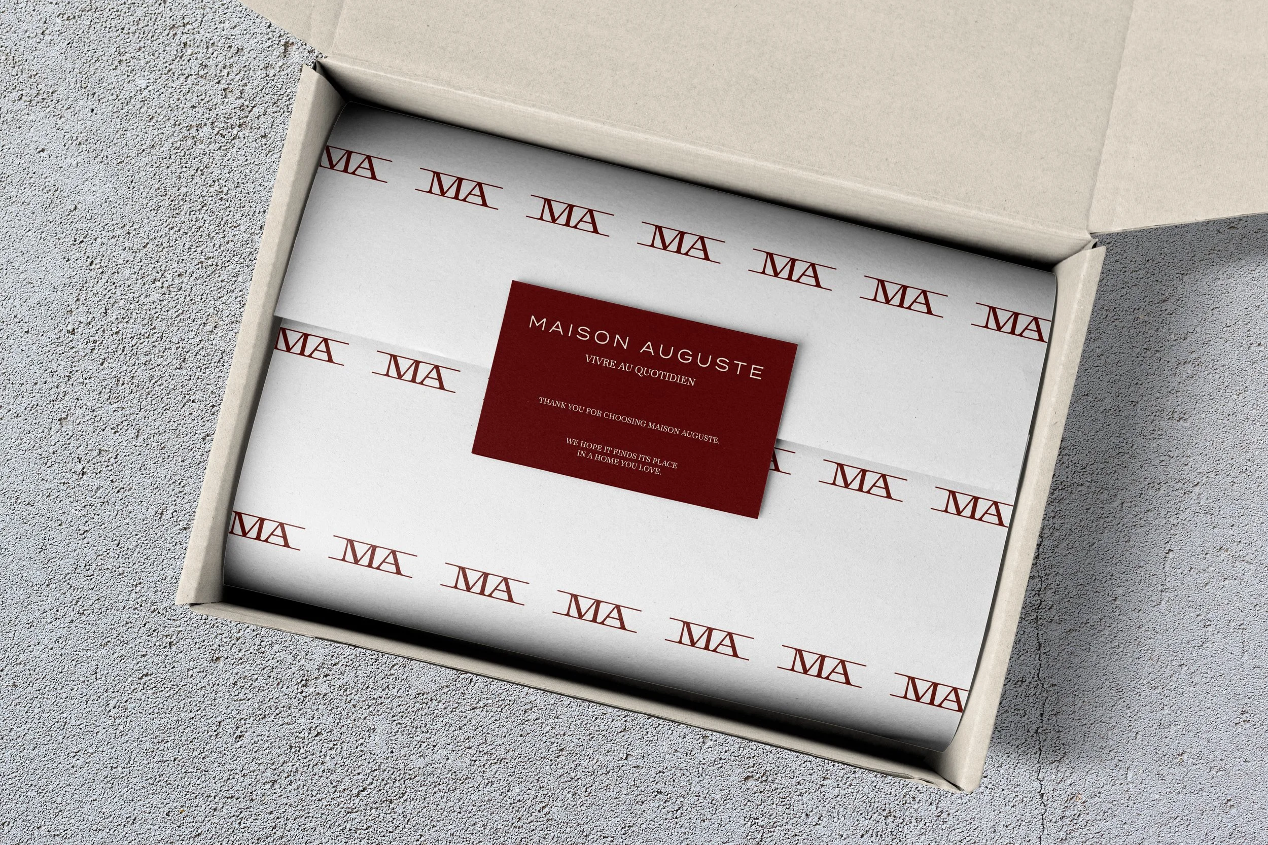
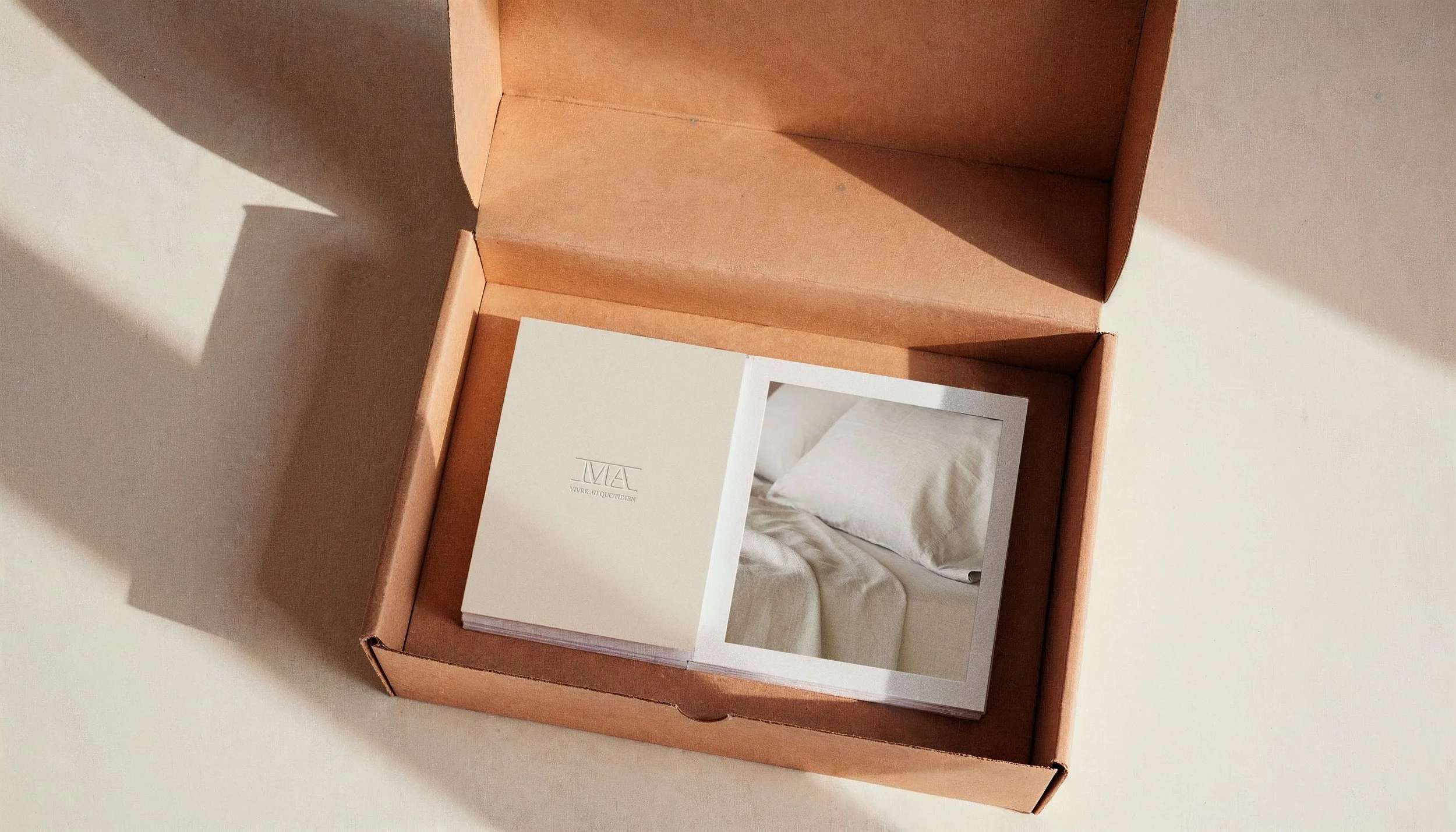
The identity is built on the MA monogram, a custom lettermark where both initials share a common baseline structured like a small architectural element. It carries the brand across every scale: a circular seal on shipping tissue, a mark on a catalogue cover, a pattern repeating across box liners. The wordmark sits in a refined serif with generous tracking. Nothing decorative, nothing borrowed.
Two colors. The burgundy is warm and grounded, closer to aged textile than to corporate red. The off-white comes from the material itself: unbleached linen, undyed cotton, morning light through curtains. Together they avoid the cold minimalism that dominates the category and stay closer to something lived-in.
The system was applied across every object the brand sends into a home. Shipping boxes in kraft, lined with MA tissue paper. A burgundy circular seal closing every order. Collection booklets organized by room, starting with La Chambre. A thank-you card inside every package. Each piece designed to feel like it already belongs somewhere.