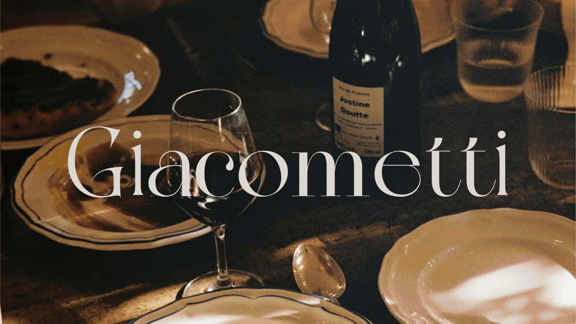
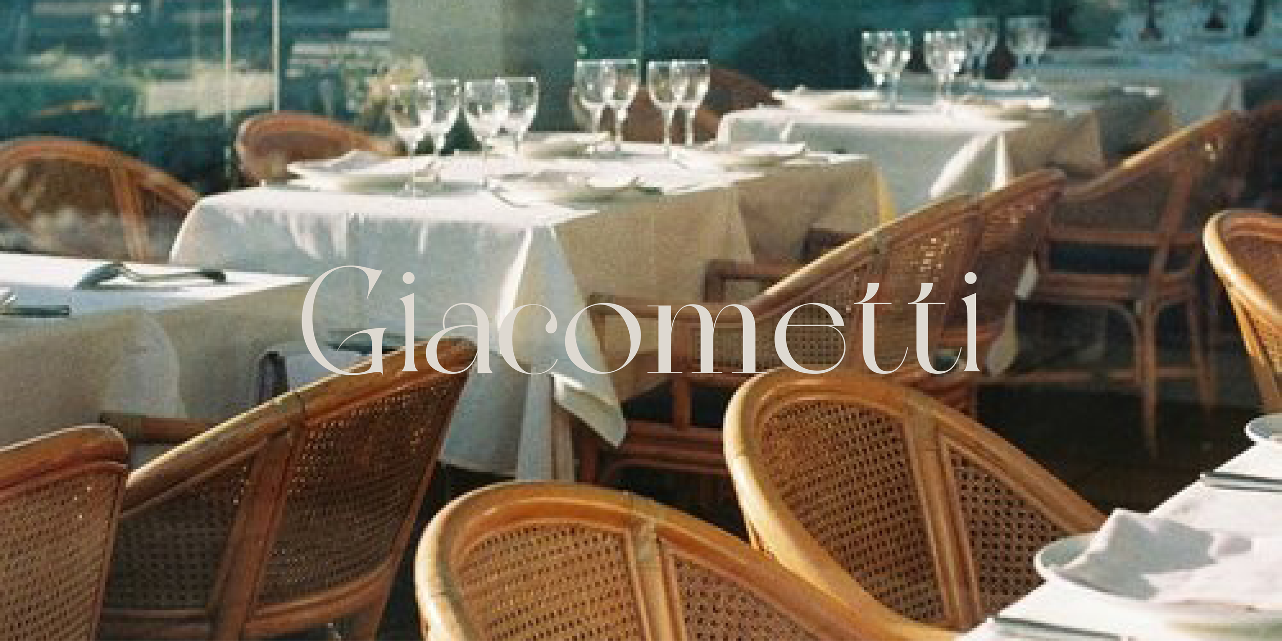
Giacometti
Branding / Visual Identity / Packaging / Art DirectionGiacometti is a Neapolitan pizzeria that has been part of Brussels since 1976. The brief was to give an existing story the visual language it finally deserved.
Giacometti carries fifty years of family history in a single name. Three brothers, one grandmother, and a restaurant that became a fixture of the city without ever needing to announce itself. The challenge was to honor that weight without turning it into a costume.
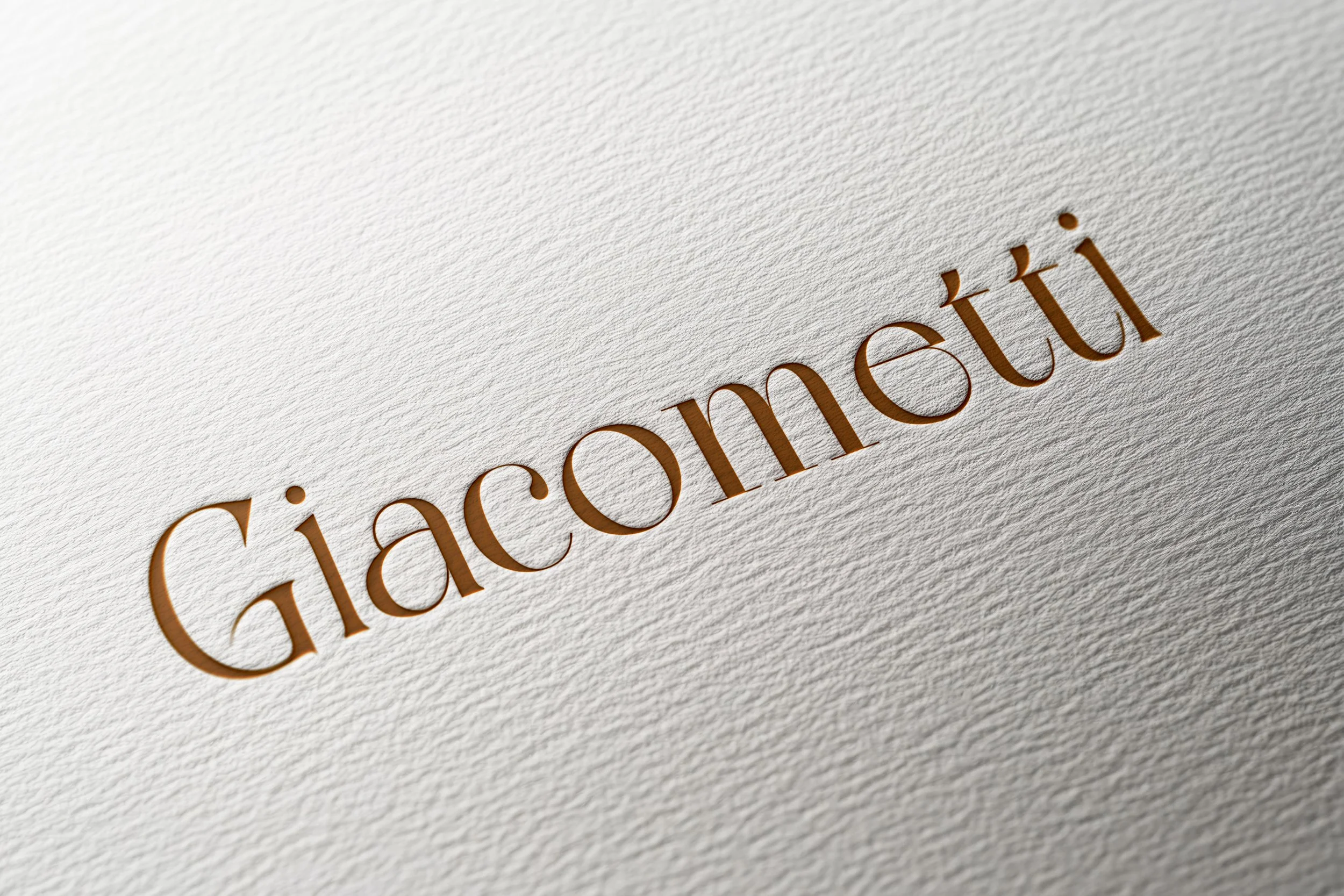
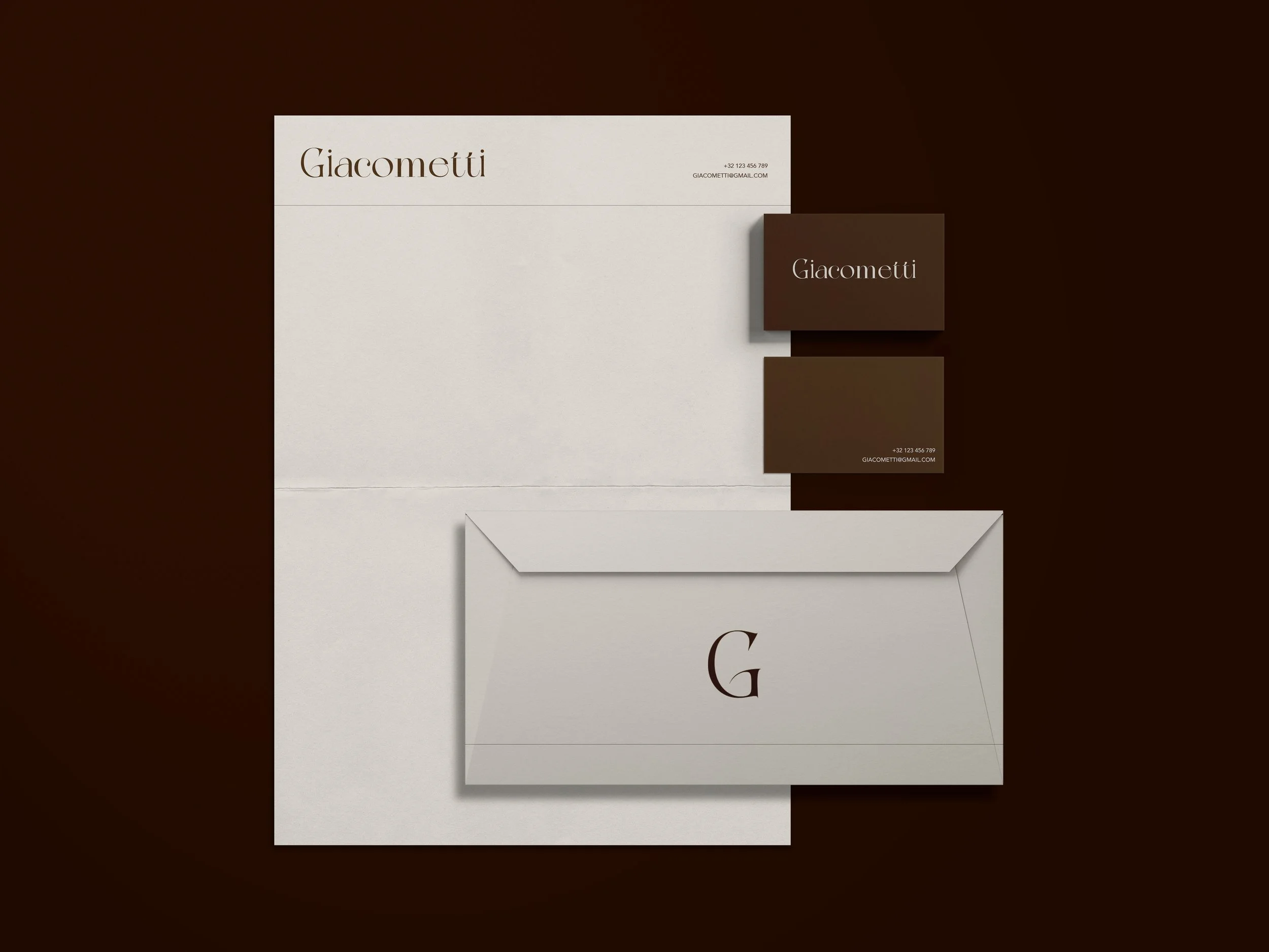
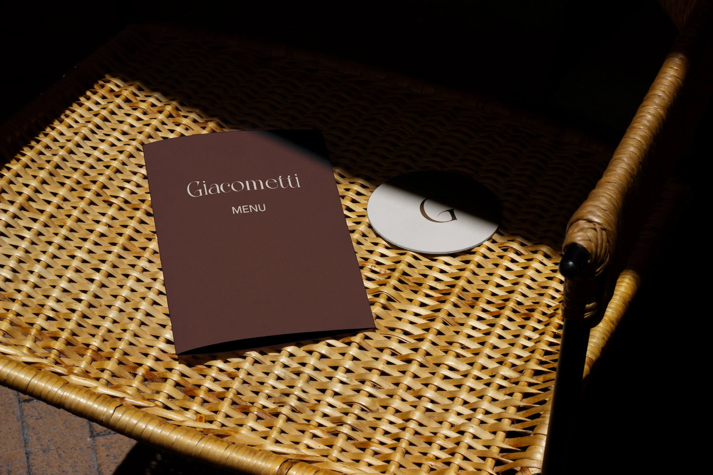
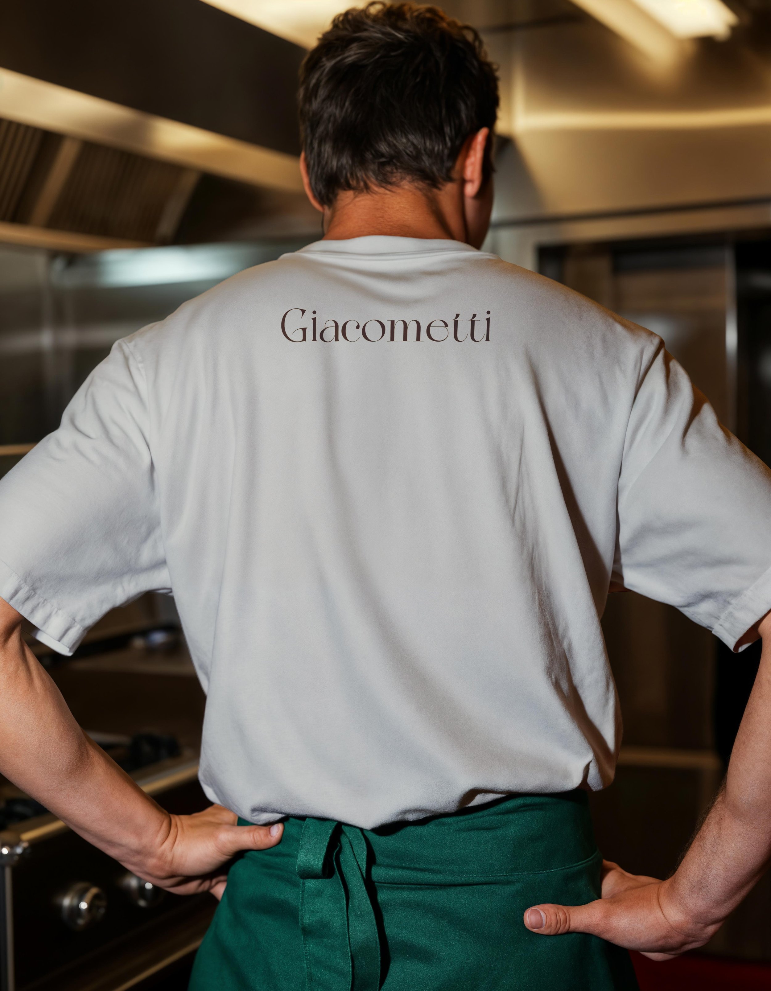
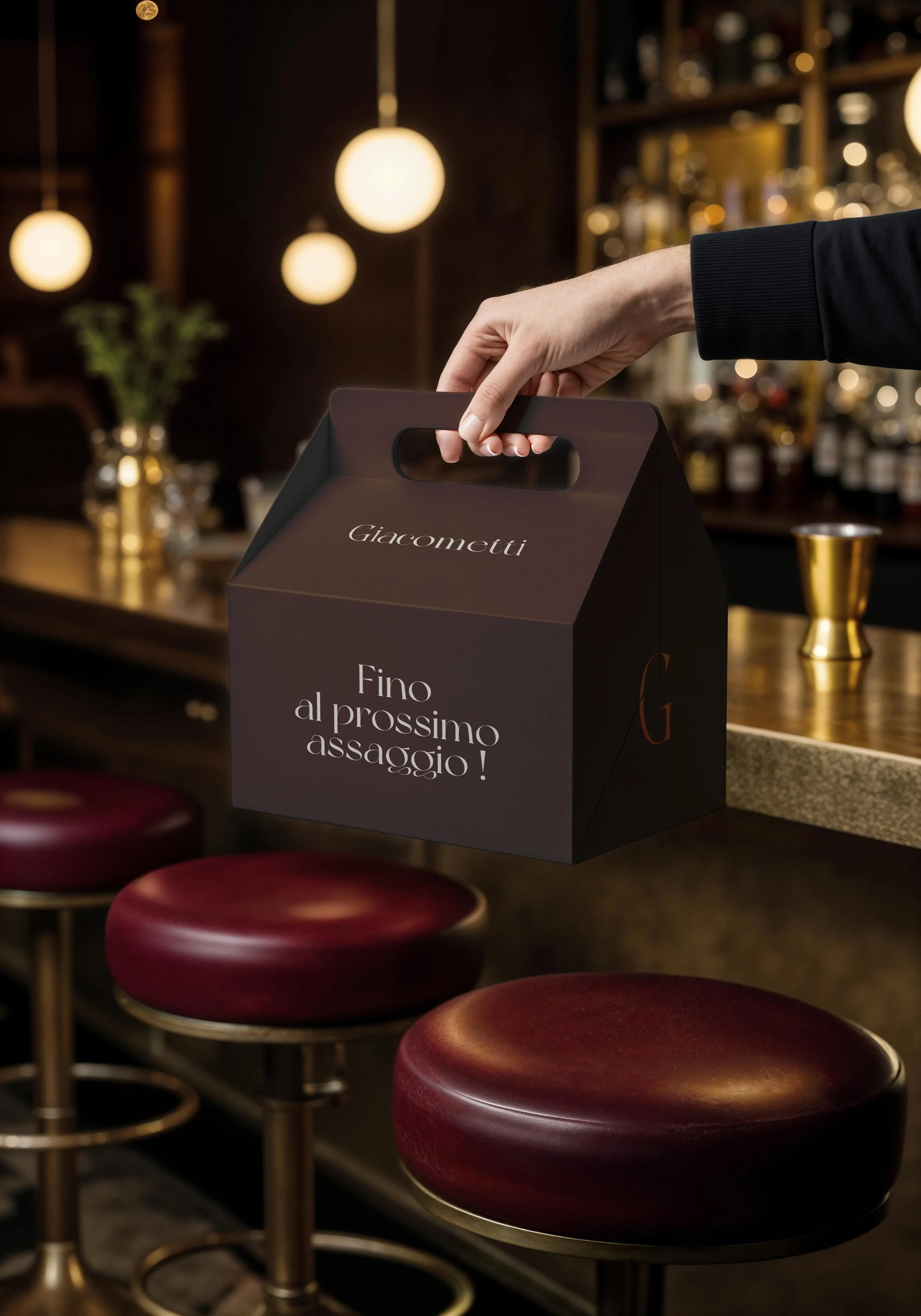
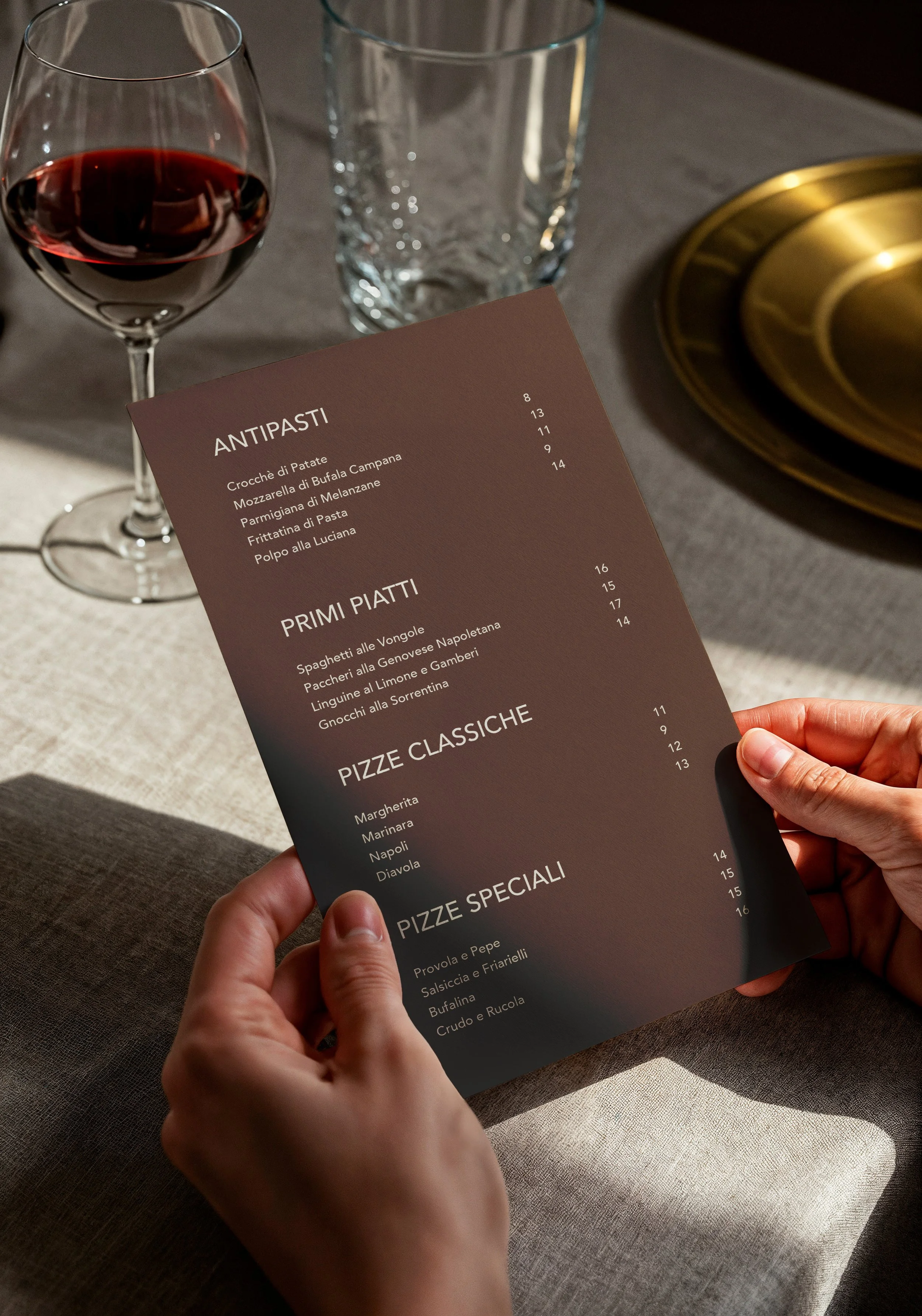
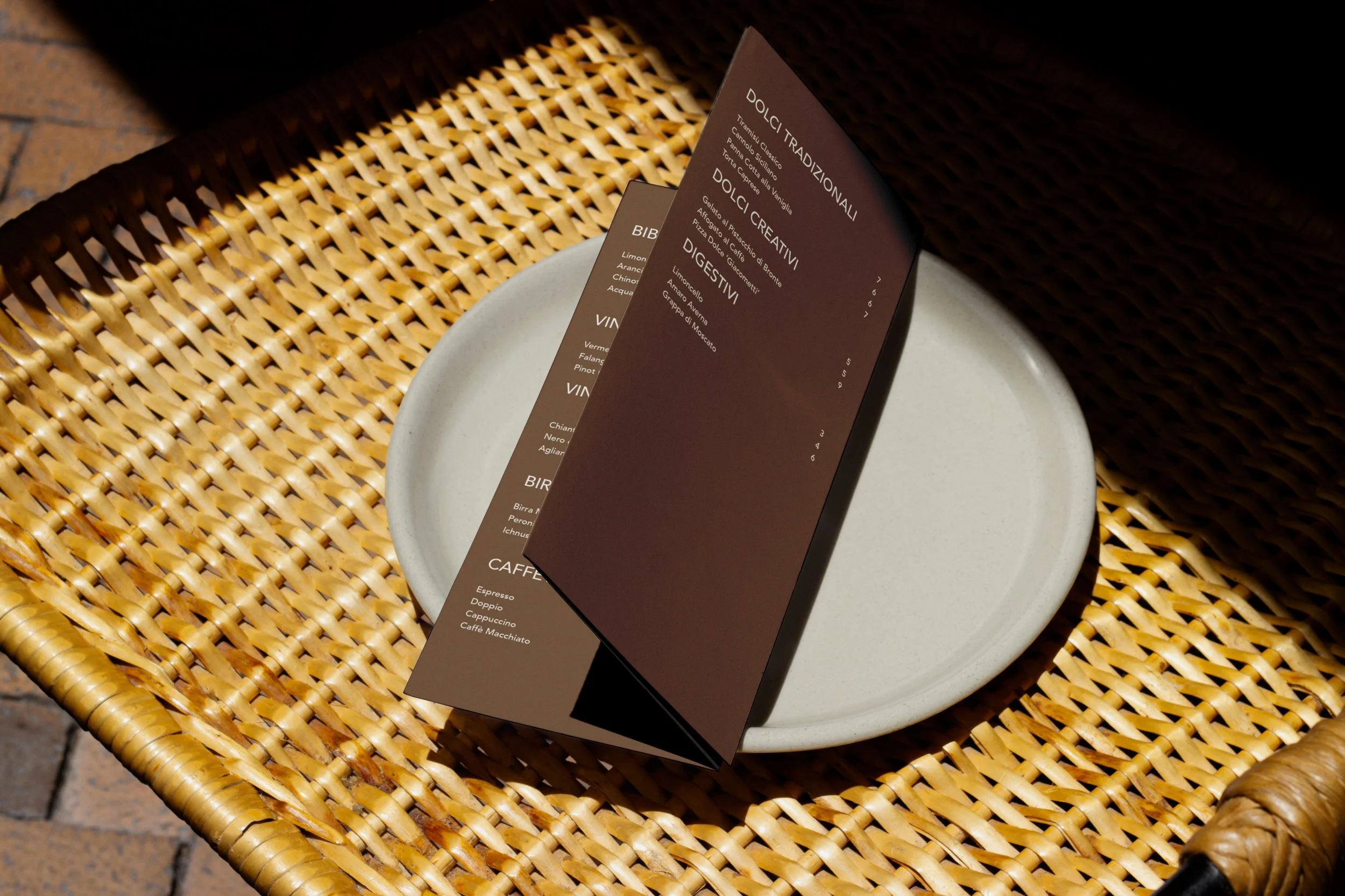
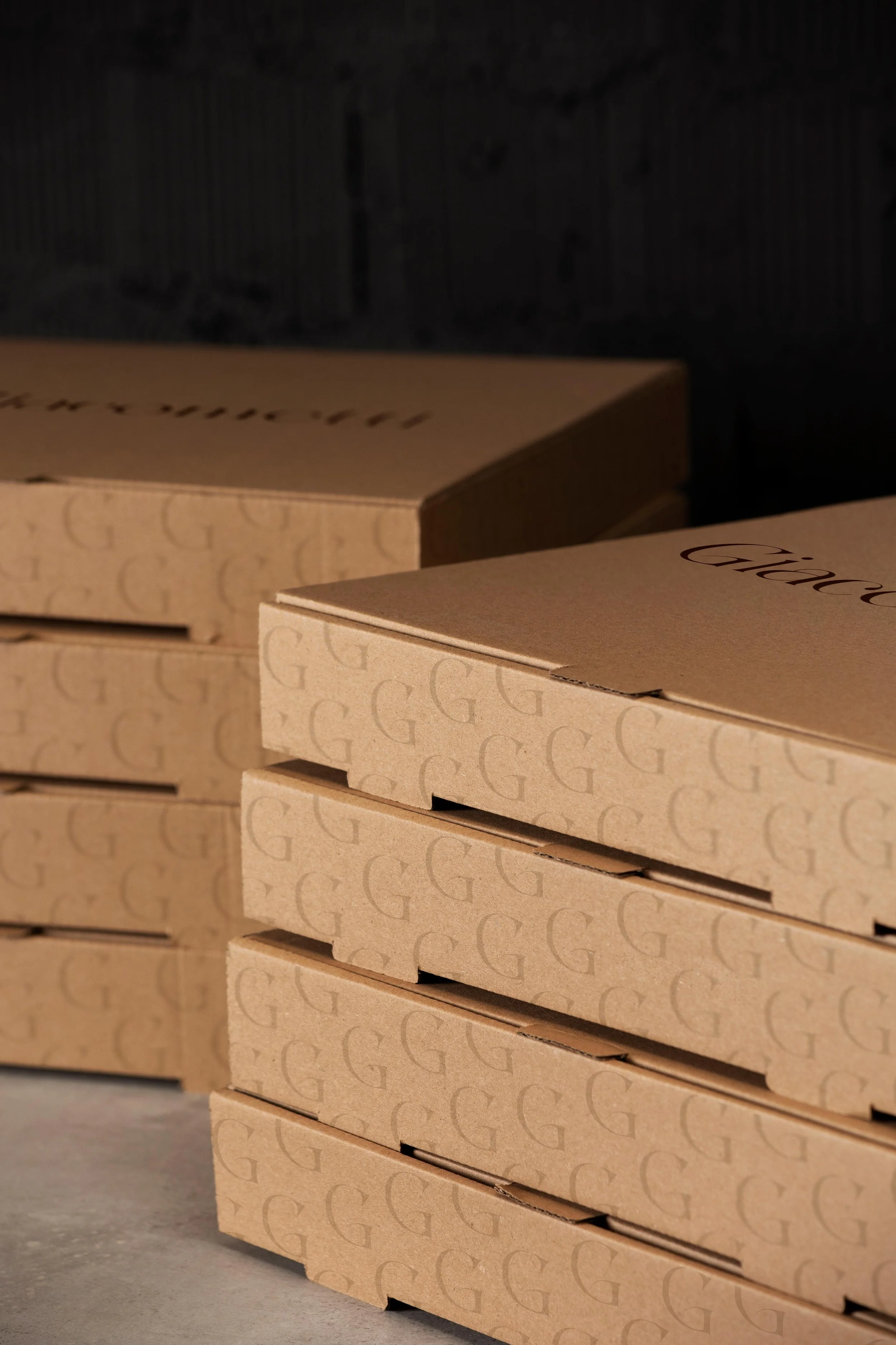
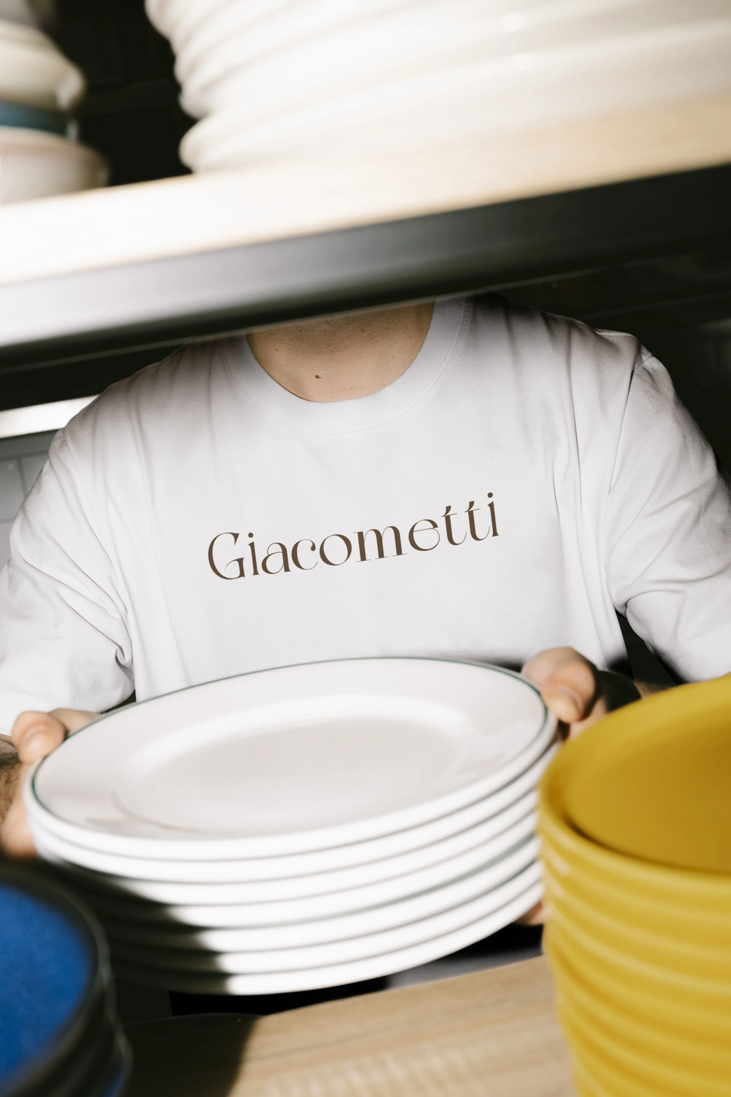
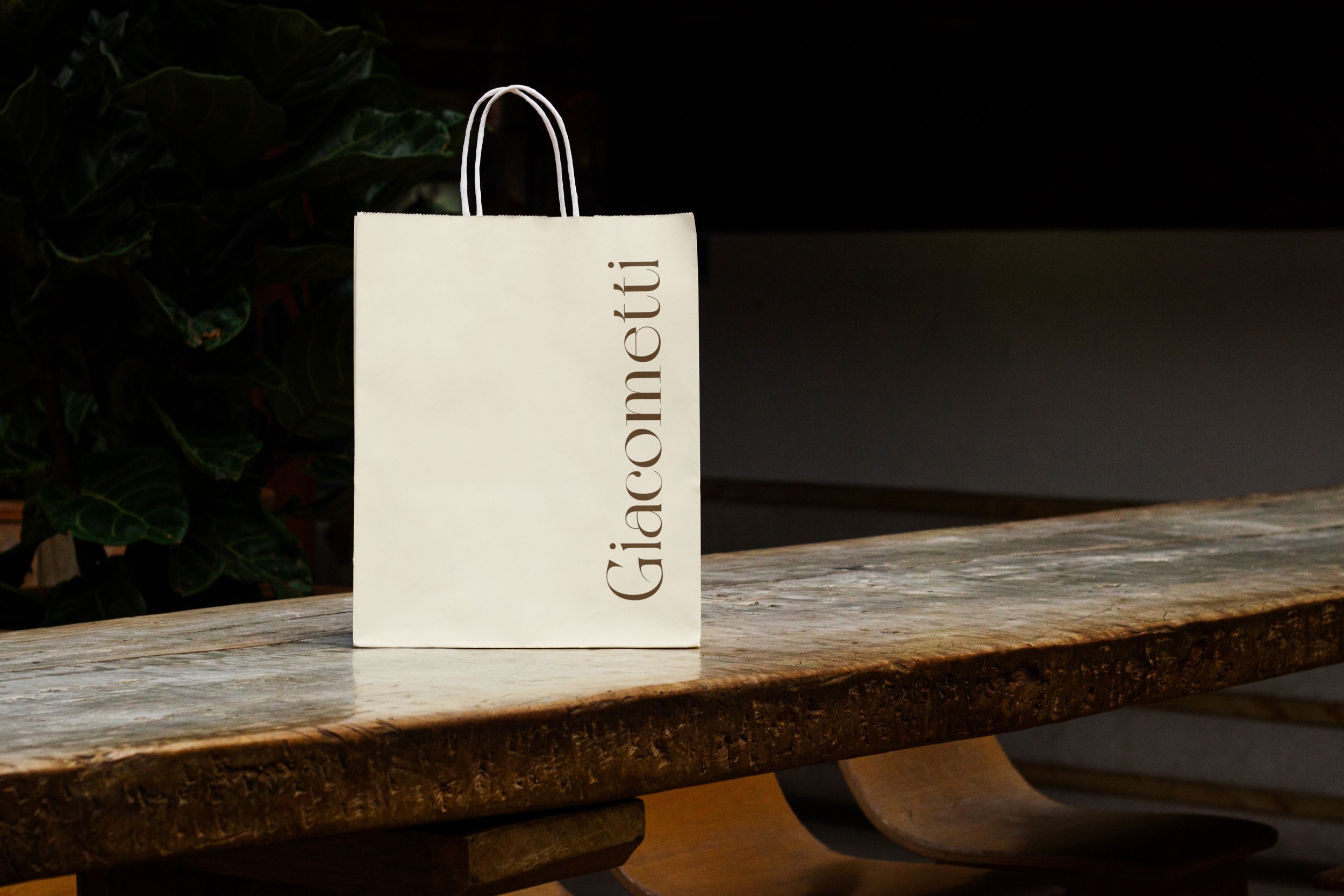
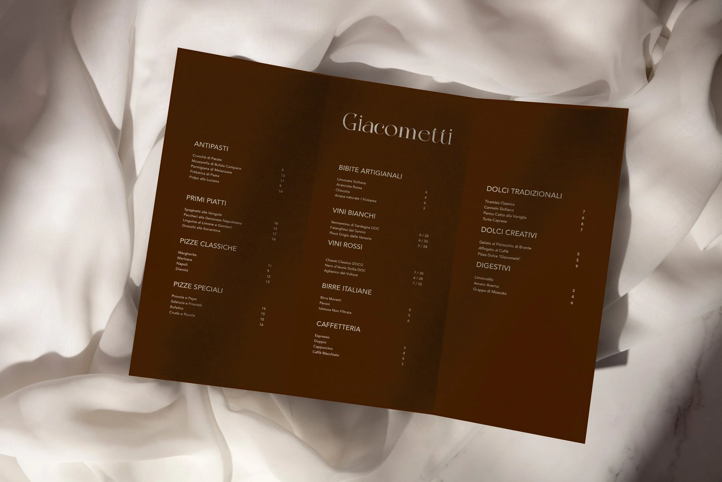
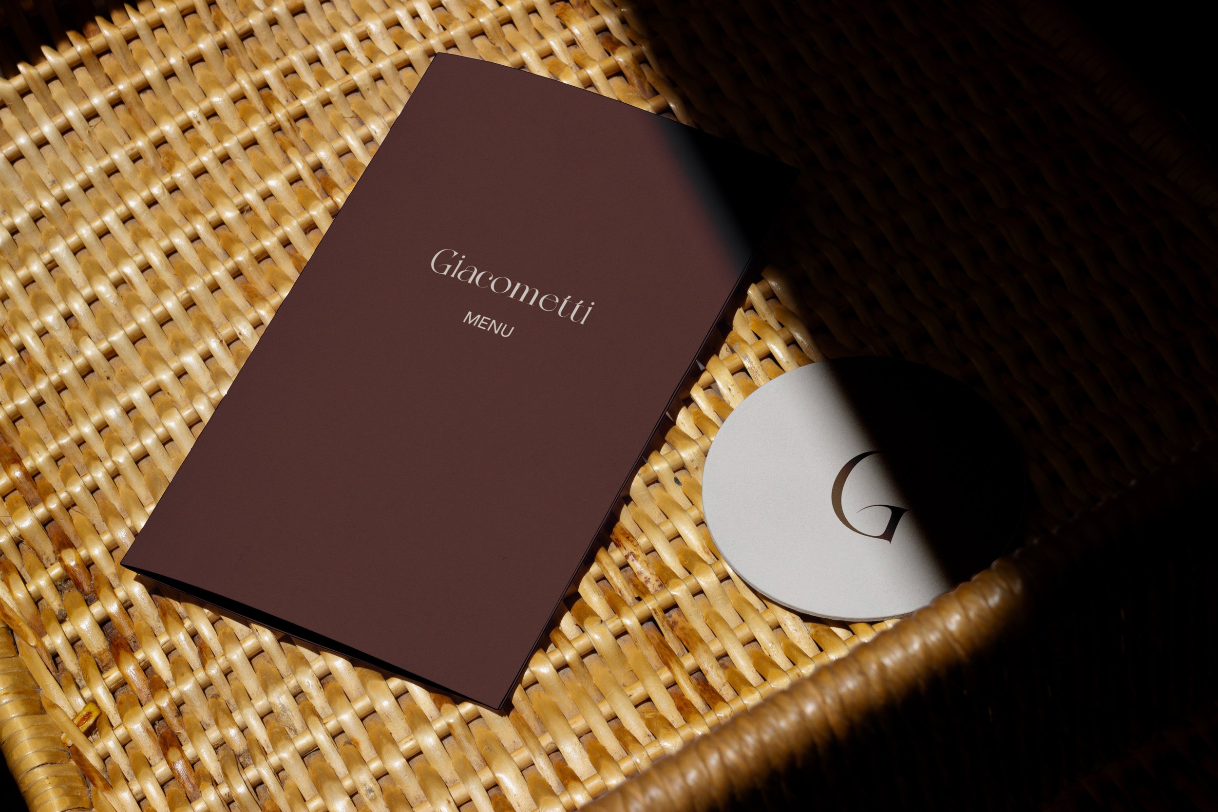
The identity is built entirely on letterform. A high-contrast serif wordmark expressive enough to carry character, disciplined enough to hold across every surface. The G, isolated, becomes a second mark: repeated as an all-over pattern on pizza boxes, pressed into coasters, embossed on envelopes. No illustration, no borrowed visual clichés.
The palette was kept to two colors: an off-white drawn from flour and linen, and a deep brown that recalls a wood-fired oven and aged timber. Stopping at two was as intentional as the colors themselves. A restrained system that lets the typography breathe and gives every application the same quiet authority.
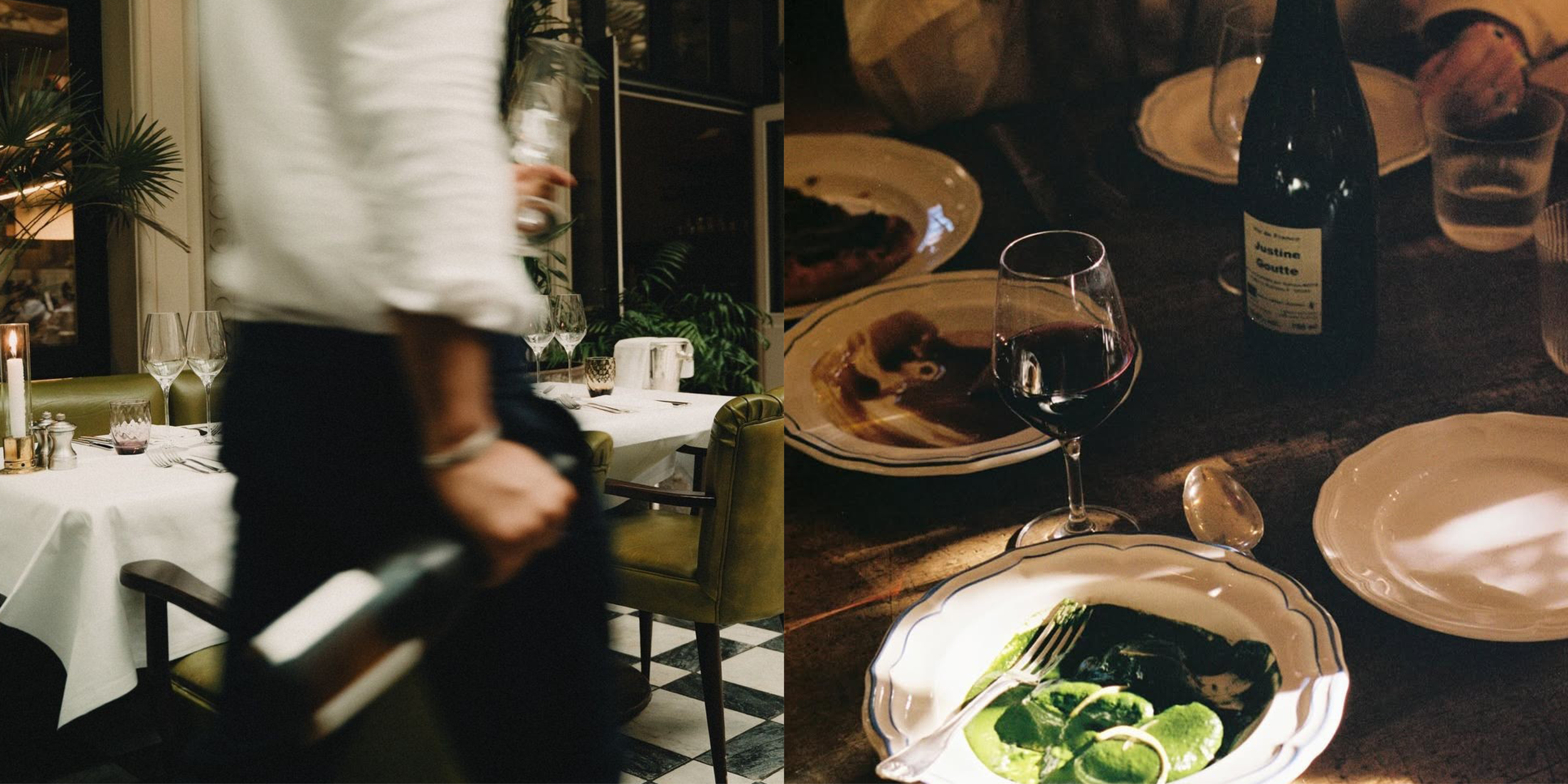
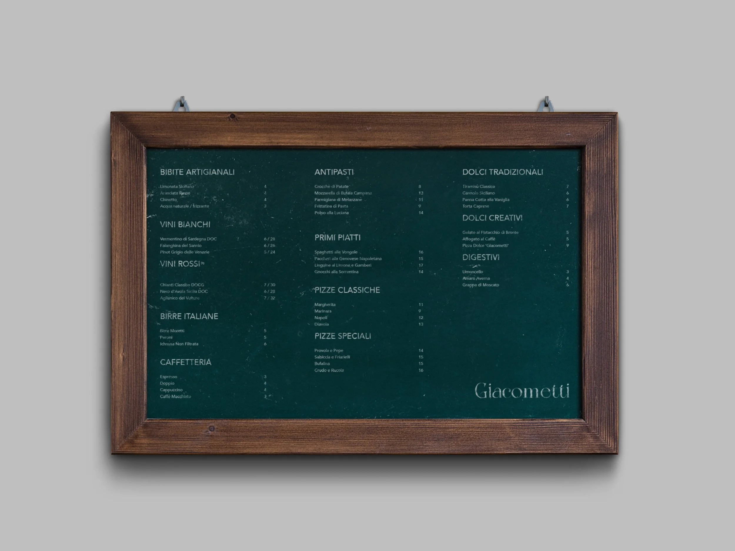
The identity was tested across every object the restaurant touches, from menus in three formats to paper bags, stationery, wine labels, and staff uniforms. Each piece considered individually. All of them unmistakably the same brand.