Bold.
Branding / Visual Identity / Packaging / Art DirectionBold is a denim brand built around a single moment: the jeans you reach for before you know where the day is going.
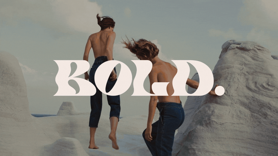
Denim is the most saturated category in fashion and the most personal garment anyone owns. Every brand claims authenticity, every campaign shows the same sun-drenched body in the same golden hour light. The challenge was to build something that felt genuinely different in register: less performative, more atmospheric. A brand that didn't tell you how to feel in the jeans, but made you feel something before you'd even put them on.
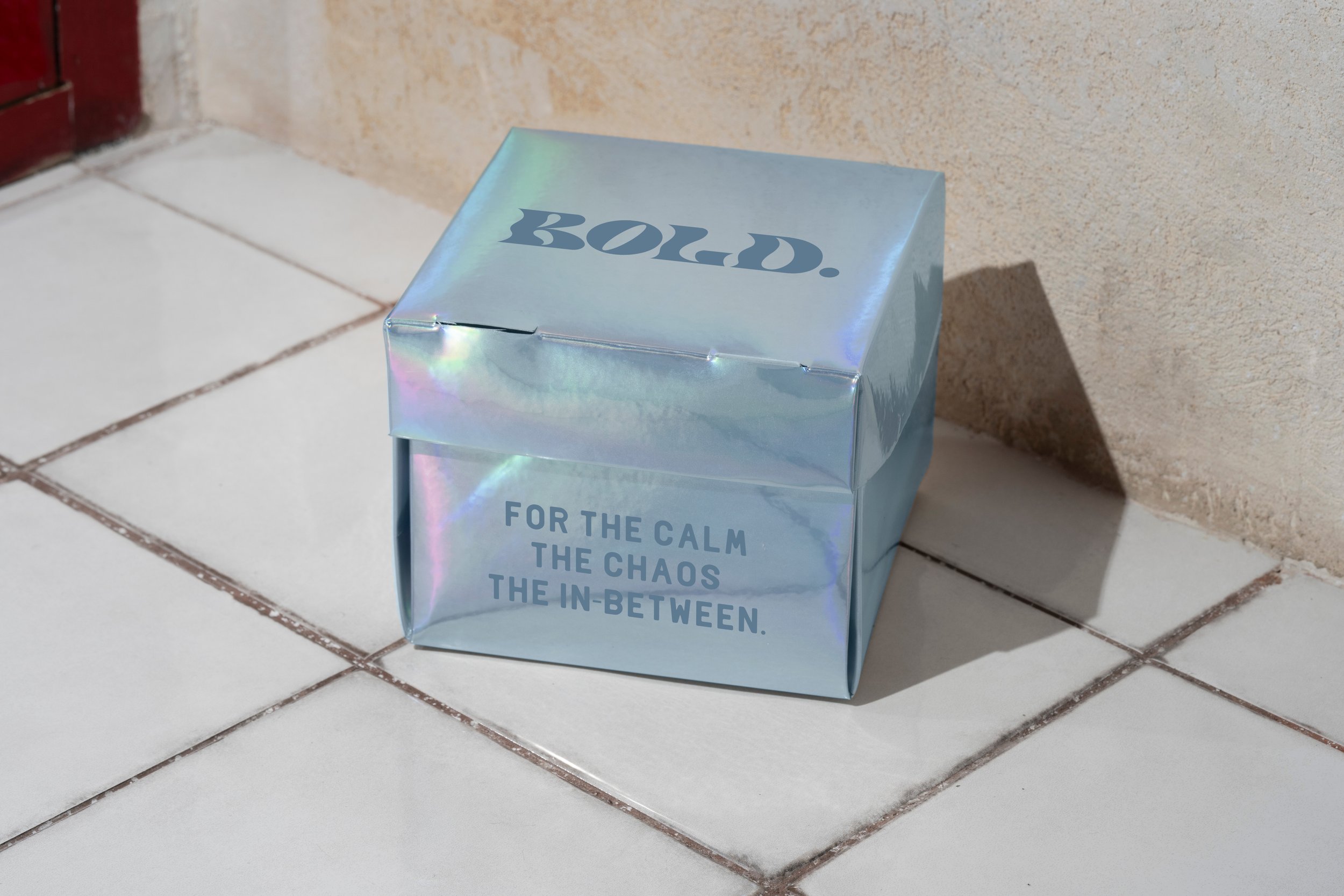
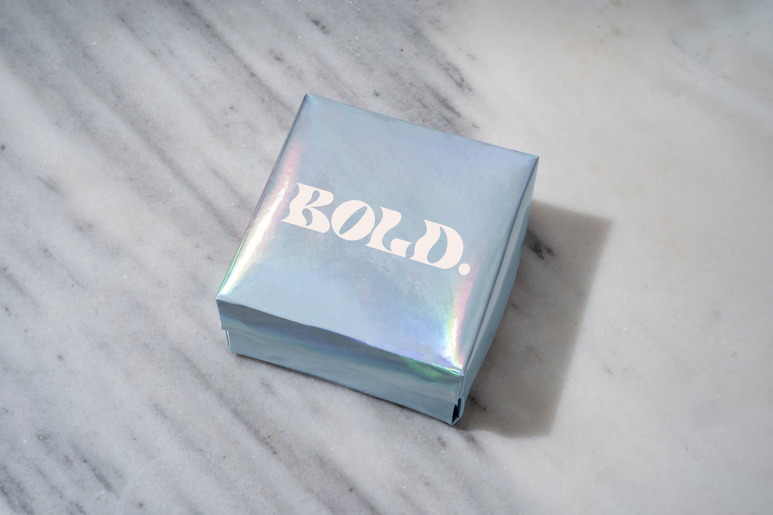
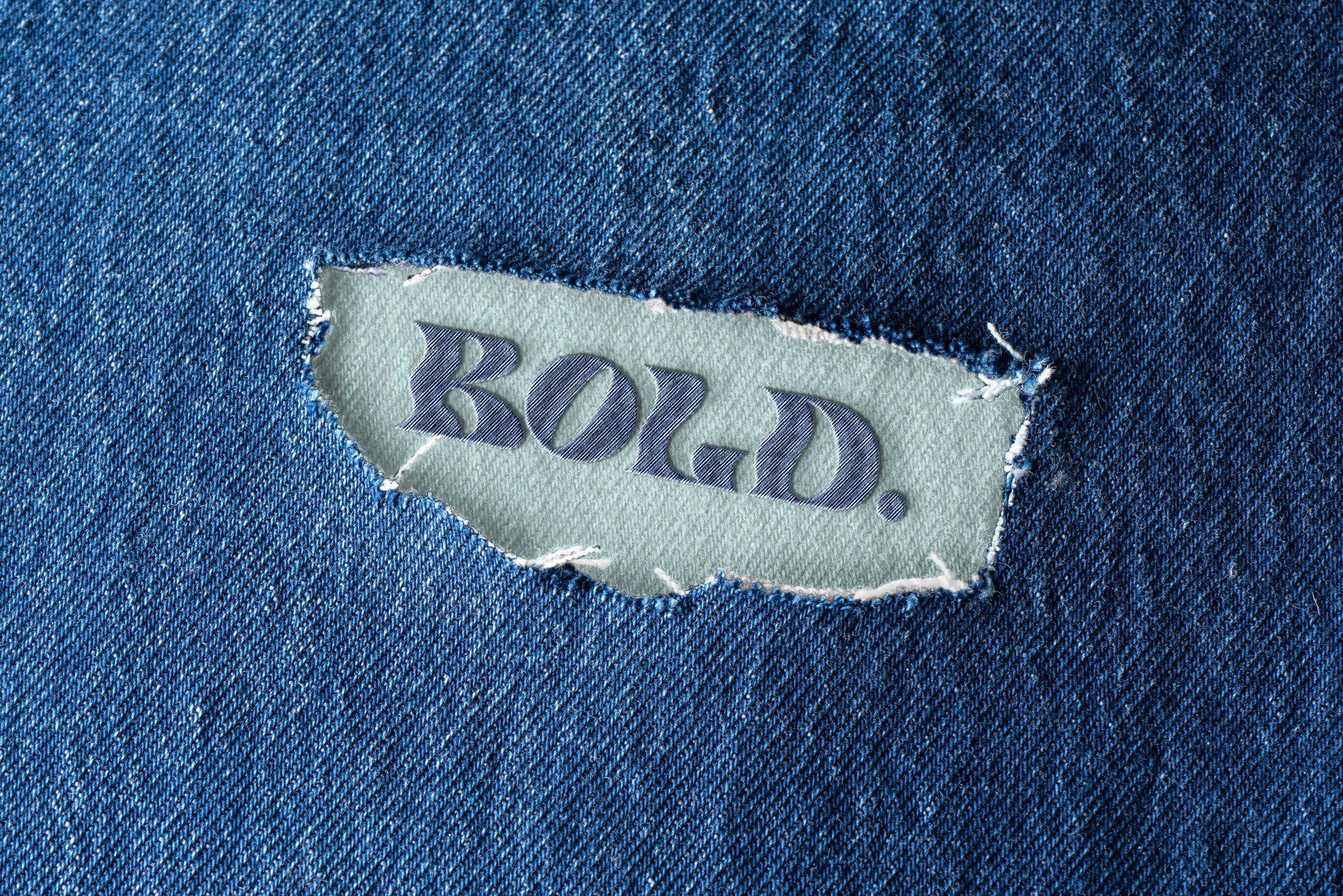
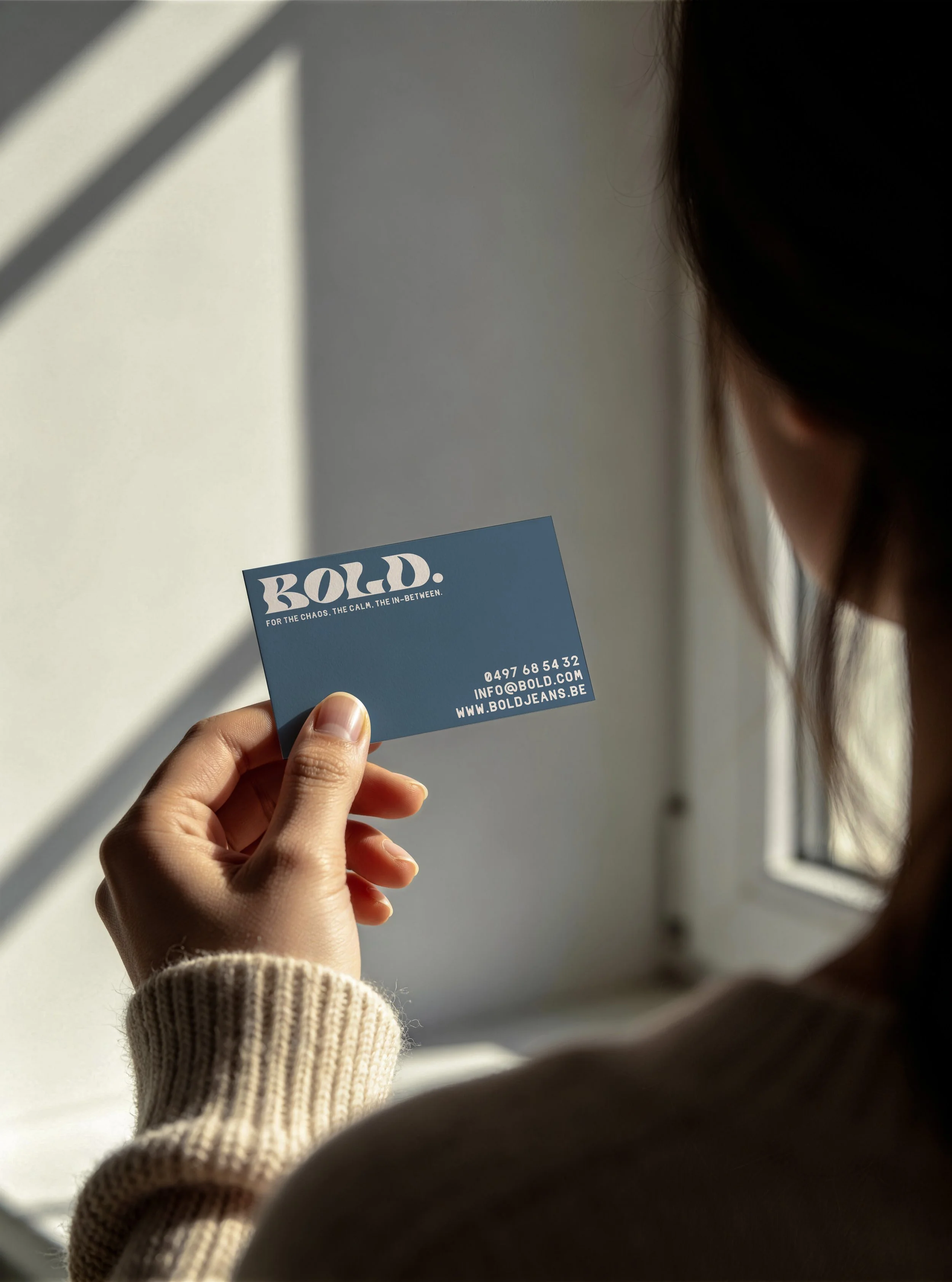
The wordmark is heavy, almost sculptural. Rounded terminals that carry the softness of fabric, the weight of something worn in. It sits directly over campaign images without competing with them: cream on denim texture, slate on iridescent surface, always large enough to be a presence rather than a label. The raw-edge woven patch, sewn directly into the fabric, brings the identity back to the material. No swirl, no pattern. Just the name, and what it lands on.
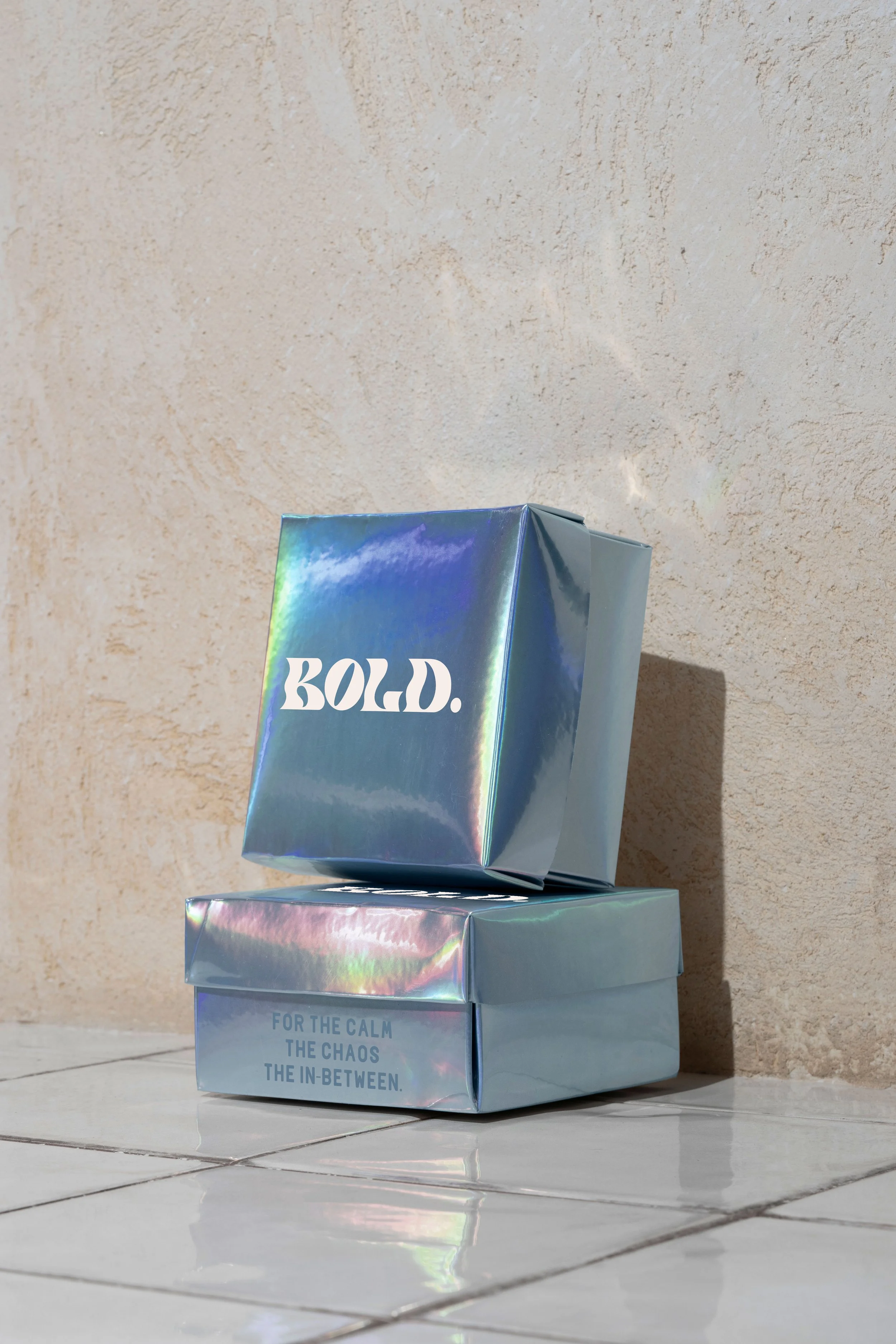
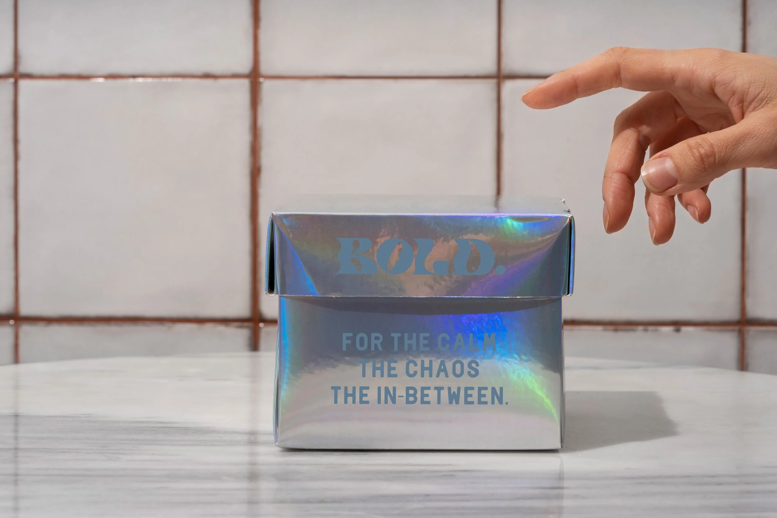
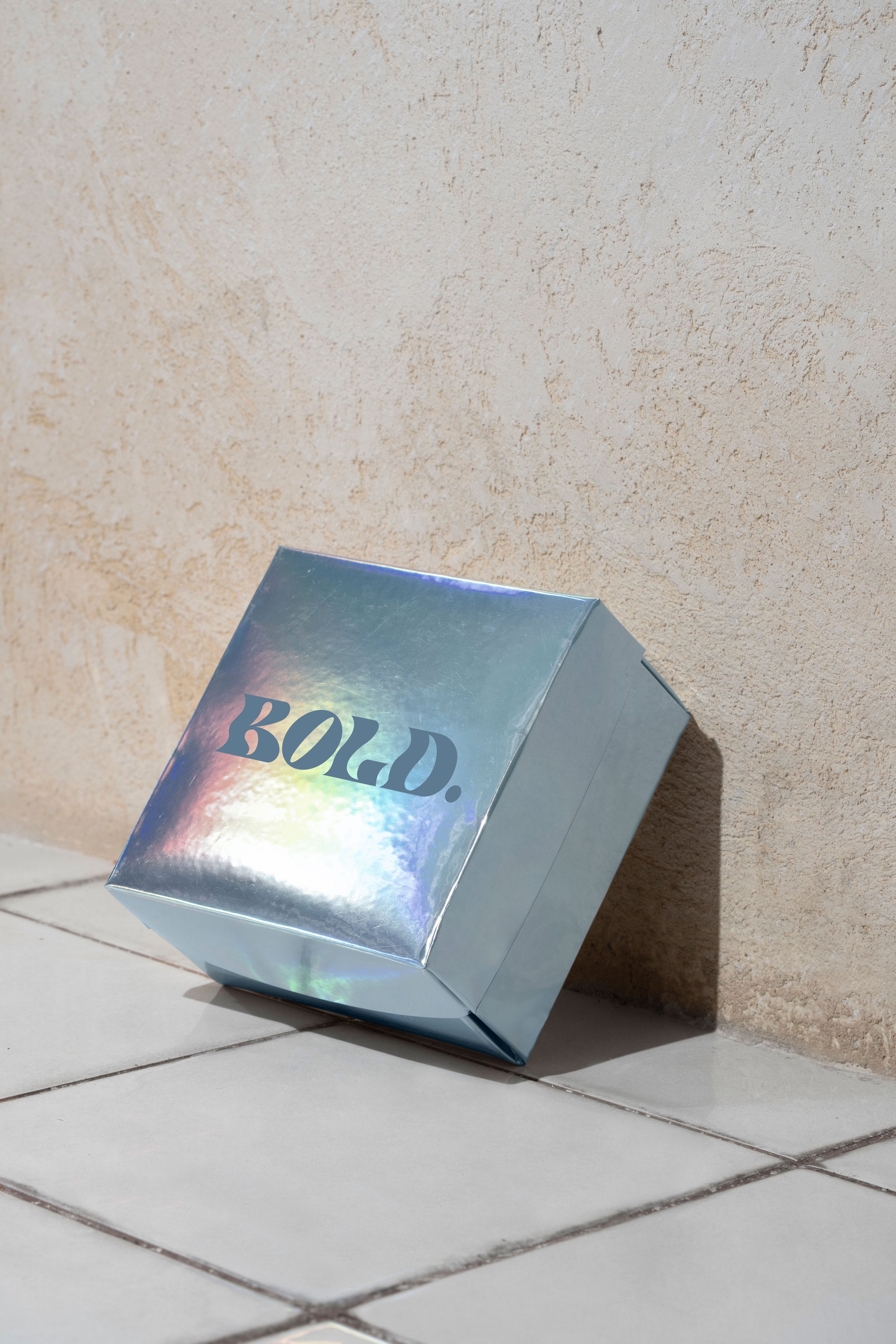
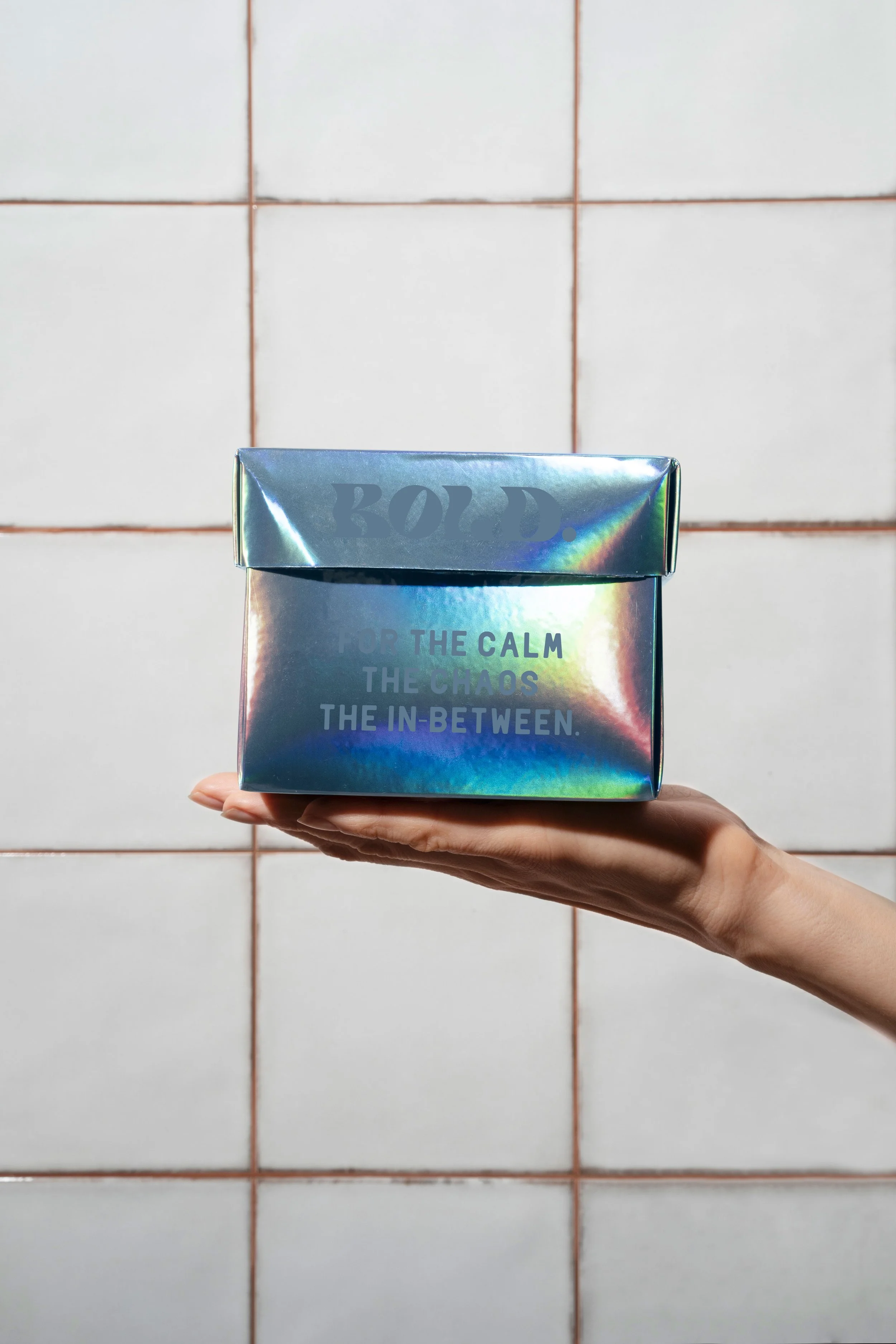
The palette shifted away from graphic saturation toward something more worn, more environmental. Dusty slate and cream, colors that already exist in denim, in concrete, in overcast sky. The iridescent holographic surface of the packaging introduces the unexpected: a material that changes with the light, never the same twice, atmospheric by nature.
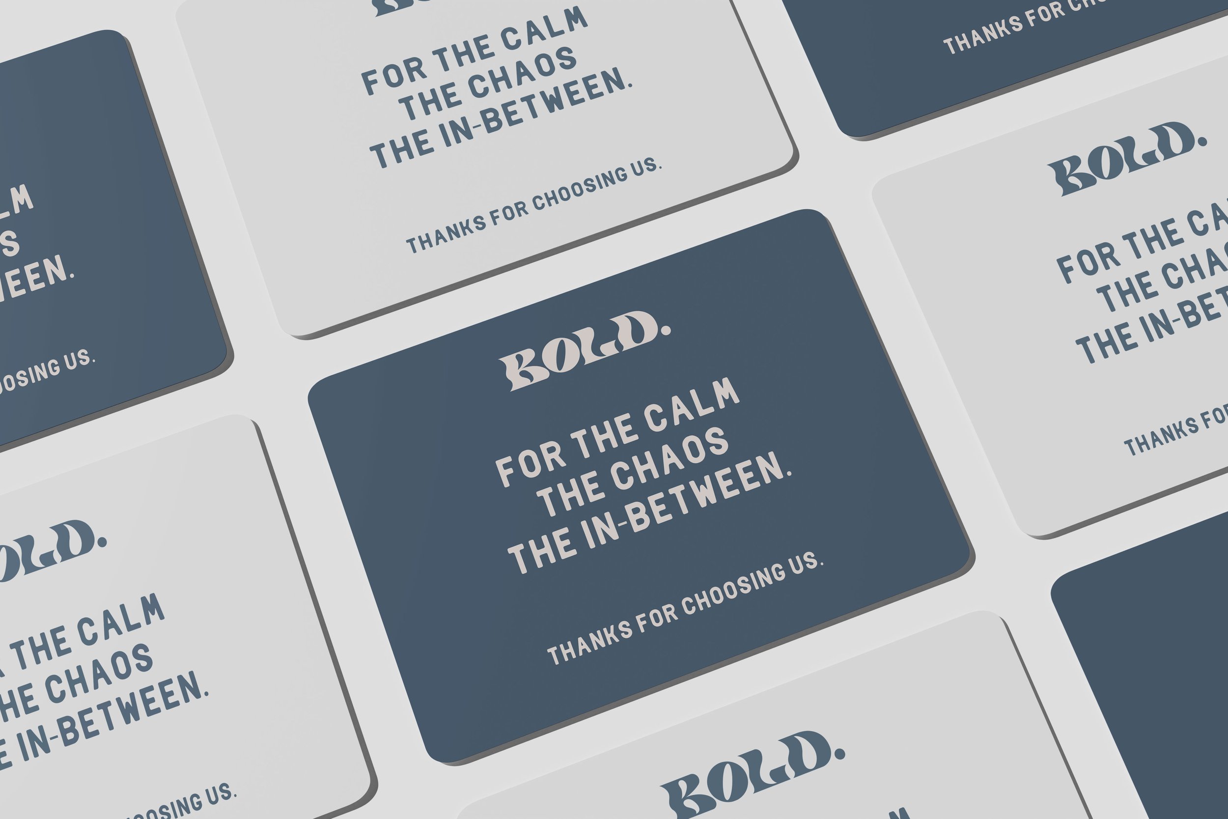
The holographic box carries the brand's central line on its side: For the calm. The chaos. The in-between. A canvas tote printed with campaign photography, the logo sitting across the image rather than beside it. A raw-edge woven patch as garment label. A thank-you card: These were made to move. So were you. Each object in a different mood. All of them unmistakably Bold.