ARCH
– The Aesthetic of Rawness
ARCH is not just a publication that reads as a spatial and visual manifesto. An editorial exploration of brutalism as both architecture and ideology, where the rawness of material meets the clarity of intent. ARCH frames brutalism not as a relic of the past, but as a living language: bold, elemental, and uncompromising.
The mission
The challenge was to capture the austere power of brutalism without falling into a cliché. We sought to construct a visual system that honored its formal rigor while allowing room for expressive, almost poetic tension. The design had to be sharp, deliberate, and contemplative, just like the architecture it interprets
The results
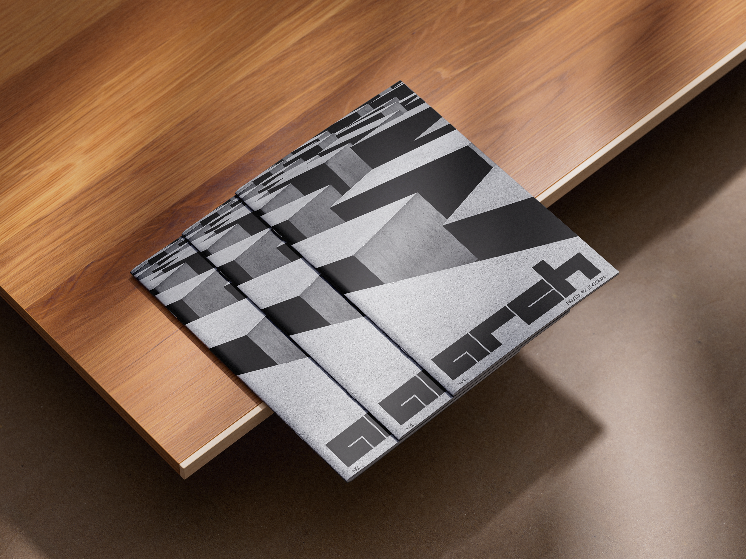
ARCH was developed as an editorial object where every element — from the modular grid to the typography — contributes to a raw, structured beauty. The visual identity is reduced to essentials: a stark, typographic logo with brutal symmetry; a monochromatic palette punctuated by shadows and textures; and a grid system that acts like architectural scaffolding.
Imagery is central to the project. Photomontages evoke fictional spaces that feel both monumental and meditative. Light is treated as a material, volume as emotion. The deliberate absence of humans and function intensifies the sculptural nature of each form, creating a stillness that invites reflection..
Typography is rigorous yet expressive, with bold, condensed headlines standing like concrete walls, while body text flows through columns with clinical precision. The layout embraces negative space, tension, and rhythm, echoing the architectural cadence of brutalism itself.
ARCH is now reflecting its true nature at the intersection of a magazine and a conceptual space. A visual essay on structure, weight, and intention. A celebration of the aesthetics of rawness, presented through a graphic system that is as uncompromising as the buildings it reveres.
Branding strategy
Visual identity
Logo and graphic design
Print design